The 500px Photographer Spotlight invites you to dive into the minds and methods of the incredible photographers who shape our community. Discover the unique journeys, creative insights, and inspiring stories behind the stunning photos we love.
Meet Marco Tagliarino
He is also a passionate photographer with a bold, diverse portfolio spanning global landscapes and street portraits. Driven by curiosity and authenticity, his work documents the human experience. In this 500px Photographer Spotlight, we explore how his technical background shapes his spontaneous creative process, his approach to ethical travel documentation, and the emotional depth of his visual storytelling.
You have a full-time career in engineering. How do you find that your analytical, technical mindset from engineering influences or, conversely, contrasts with your creative process as a photographer?
My technical background has taught me to observe the world with precision, attention to detail, and a strong inclination toward logic. These aspects influence my photographic approach, especially in composition, light management, and the reading of geometries, elements that often emerge in my architectural and landscape shots.
At the same time, photography is a form of release for me. After spending dozens and dozens of hours in the office, immersed in a demanding and intense routine, traveling and photographing become a way to let out the energy I accumulate and that has no space in my professional context. It’s the moment when I allow myself to be guided by intuition, emotion, and curiosity, without having to follow rigid frameworks.
In this contrast between rationality and spontaneity, I find my creative balance. My technical mindset gives me the tools to build and analyze, while photography allows me to interpret and feel. And when these two dimensions meet, I’m able to tell visual stories that are both structured and deeply human.
Your portfolio is incredibly diverse, spanning landscapes, wildlife, and intimate street portraits across continents. Is there a common thread or a central story you are trying to tell with your photography, regardless of the subject?
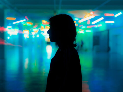
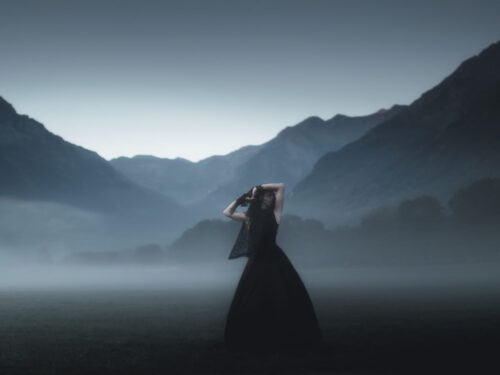
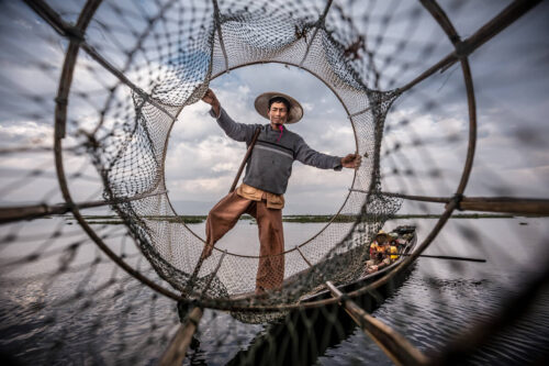
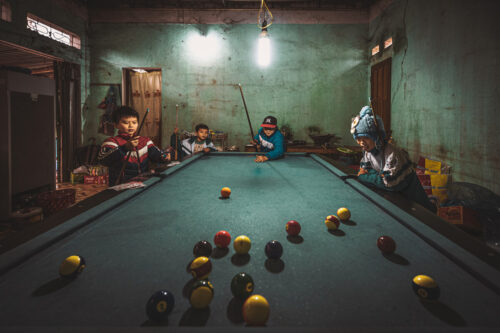
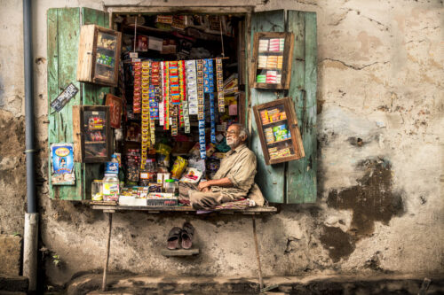
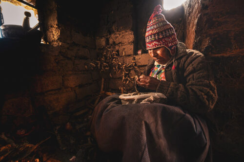
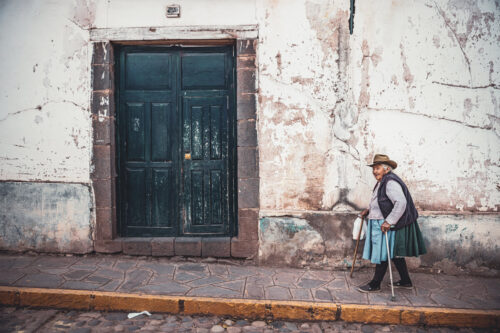
Although my portfolio spans a wide range of subjects, from remote landscapes to bustling street scenes and intimate portraits, there is indeed a common thread that runs through all my work: the human experience in its many forms. Whether I’m capturing the quiet dignity of a craftsman in his workshop, the raw beauty of nature, or the fleeting emotion on a stranger’s face, my goal is always to tell stories that resonate emotionally and culturally.
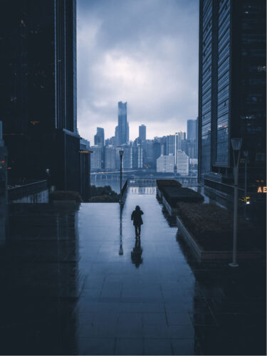
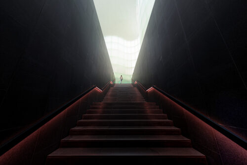
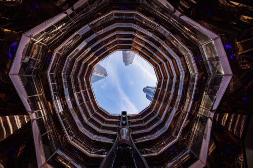
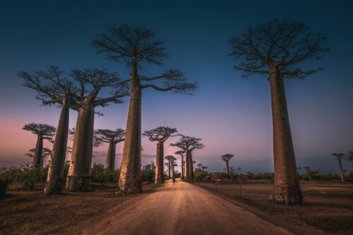
Even when photographing architecture, I approach it not just as a study of form and design, but as a reflection of the culture and identity of a place. Buildings and urban spaces are shaped by the people who inhabit them, and in turn, they shape how those people live, interact, and evolve. For me, architecture is part of the broader narrative of human presence, it’s another way to explore the soul of a location.
Photography, for me, is a way to explore and share the richness of our planet and its diverse cultures. I’m driven by intuition and a deep curiosity for the world, and I strive to create images that are not only aesthetically compelling but also authentic and meaningful. I rarely plan my shots; instead, I let the environment and the moment guide me. This spontaneity helps me preserve the honesty of the scene and the emotion it carries.
Ultimately, I see photography as a bridge between places, people, and emotions. It’s my way of inviting others to see the world through my eyes, and perhaps to feel a little closer to places they may never visit or lives they may never live.
You’ve described photography as a way to “not forget” your experiences. When you look back at a photo from years ago, does the technical aspect or the personal, emotional memory of the moment stand out to you more?
When I look back at one of my photographs from years ago, what resurfaces is not the technical perfection, but the emotion I felt in that exact moment. I remember precisely what I was feeling while taking the shot, the scents in the air, the sounds around me, the changing light, and the details of the environment that surrounded me. It’s as if the photo becomes a time portal, bringing me back with a romantic and deeply personal intensity.
Of course, the technical side matters, but it fades into the background compared to the emotional memory. Each image is a fragment of life, a way not to forget. After long and demanding days in the office, I often feel the need to escape, to reconnect with myself. Traveling and photographing allow me to gather emotions that I later relive through my images.
Photography, for me, is a form of introspection, not just a tool to observe the world, but a way to rediscover parts of myself that time might otherwise erase.
How do you navigate the challenge of capturing a powerful, well-composed shot in unpredictable environments, especially in street photography?
Street photography and travel documentary photography, for me, are a constant pursuit of authenticity. I dedicate time and attention to observing, searching for interesting subjects in their natural environments, in spontaneous and unposed situations. I’m drawn to capturing the essence of real moments, not staged scenes.
I don’t enjoy photographs produced in pre-arranged photography workshops, where everything is already set up and often lacks the spontaneity I rigorously seek. In those contexts, I feel the truth of the moment is lost, the raw imperfection that makes an image truly alive.
That said, technical perfection is fundamental to me. A powerful photograph must be well composed, balanced in light, and precise in detail. It’s the combination of spontaneity and technical rigor that makes a shot truly effective.
The challenge lies in capturing the unexpected with awareness: allowing intuition to guide me, while keeping a sharp eye on the visual structure of the image. That’s where the strength of a photograph is born, in its ability to be both genuine and technically solid.
What would you consider crucial or essential in crafting a compelling photo?
For me, a compelling photograph is born from the balance between intention, technical precision, and authenticity. Every shot must have a deeper motivation; I don’t photograph randomly, but to tell something that moved me, surprised me, or made me reflect.
Composition is essential: I always seek a visual order that guides the viewer’s eye, gives strength to the subject, and enhances the scene. Technical perfection is equally crucial; the light, sharpness, control of contrast, and color are tools I use with precision to make the image effective and readable.
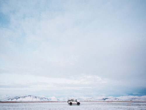
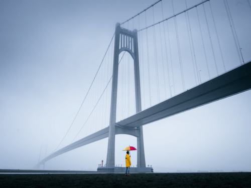
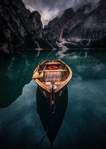
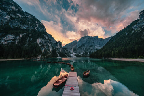
In architectural and landscape photography, I always try to introduce a visual element that emphasizes the sense of scale and vastness of the subject. While many landscape photographers rely heavily on light to elevate their shots, I focus on these narrative elements as well, which bring depth and meaning to a context that is, by nature, static. It’s often this detail that transforms a scene into a story.
But what truly makes a photo powerful is its truth. I look for spontaneous situations, subjects in their real environments, and authentic moments. The raw imperfection, the unexpected detail, the emotion that emerges without being forced—these are the elements that turn a photograph into a visual story that speaks for itself.
Can you describe your post-production and editing process? How do you know when an edit is “finished” and has successfully translated the emotion you felt when you clicked the shutter?
Post-production, for me, is a delicate and almost intimate phase. It’s never a mechanical process, but a moment where I try to reconnect with the emotion I felt when I took the shot. I work carefully on light, contrast, color, and detail, always to faithfully convey what I experienced in that precise instant.
Over time, I’ve developed a personal style, which I hope is now recognizable: a bold and impactful visual language, defined by strong contrasts and intense color tones. This approach helps me give visual strength to the image and clearly communicate the atmosphere and meaning of the moment.
Sometimes I choose black and white, but only when I feel that color would detract from the story rather than enhance it. In those cases, removing color becomes a narrative choice, allowing for greater emotional depth and clarity.
I don’t like to distort the image; I aim to keep it authentic, respecting the original scene. Sometimes it takes very little, other times more work, but my goal is always the same: to bring out the feeling, the breath of the moment.
I know an edit is “finished” when, looking at the photo, I can relive everything: the atmosphere, the sounds, the smells, the light, and above all, my emotional state. If that feeling comes back to life, then I know I’ve done my job.
As a photographer who has won numerous awards, how has this recognition impacted your work? Does it add pressure, or does it simply validate the personal passion you’ve been pursuing?
The awards I’ve received over time are certainly gratifying, but they’ve never been the driving force behind my photographic work. I see them as external confirmation of a personal journey, one built on passion, research, and stylistic consistency.
I don’t feel pressure from recognition, but rather a responsibility to remain true to myself and my vision. Over time, I’ve developed a personal style that I hope is now recognizable: a bold and impactful photographic language, defined by strong contrasts and intense color tones, always aiming to tell a story, even in quieter contexts like landscape or architectural photography.
That said, I’ve grown increasingly disenchanted with paid international contests, which I now see as part of a business often influenced by political choices and power dynamics. For this reason, I’ve chosen not to affiliate with any photographic groups or associations.
Instead, I enjoy participating in free contest platforms, where I can engage with many talented photographers in a spirit of openness and mutual respect, without the frustration or jealousy that competitive environments can sometimes generate. In these spaces, there’s no need to bow to dominant currents that decide who is talented and who is not. There’s just photography, and the joy of growing through honest exchange and shared passion.
Platforms like 500px allow me to do exactly that: to share my work and passion with a wide community of enthusiasts, without pressure or pretense. It’s a place where photography speaks for itself, and where the focus remains on creativity, connection, and the pleasure of visual storytelling.
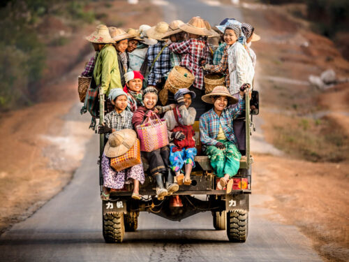
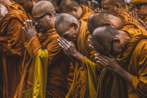
Your travel photography from places like Cuba, India, and Armenia feels both immersive and respectful. What is your personal philosophy on ethically documenting cultures that are not your own?
When I photograph cultures different from my own, the first principle that guides me is respect. I never aim to intrude, but rather to observe with discretion, trying to capture the authenticity of the moment without altering it. I approach with curiosity, but also with humility, fully aware that I am a guest in a context that doesn’t belong to me.
My travel photography is immersive, but never invasive. I look for subjects in their natural environments, in spontaneous situations, avoiding any form of spectacle or stereotype. I’m not interested in exoticizing a culture, but in portraying it as it truly is, with dignity and honesty.
Many people ask me how I manage to photograph cultures that often shy away from the camera, and the truth is, I don’t have a secret technique. There’s nothing calculated or strategic in my approach. Perhaps it’s simply empathy, humility, and respect. I believe the people I photograph can sense my genuine admiration for their way of life, for their culture, and for the beauty I see in their everyday gestures.
I believe photographers have an ethical responsibility: not to turn reality into a forced representation, but to convey it sincerely. That’s why I always try to establish a human connection, even a silent one, before taking a photo. And if I sense discomfort, I prefer not to shoot.
My goal is to transmit emotion, not just images. And if someone looking at one of my photos can feel the respect I had for that place and those people, then I know I’ve done the right thing.

After all your travels and a wide array of subjects, what is the “one photo that got away”? Is there a specific moment or scene you still think about that you weren’t able to capture?
The ‘one photo that got away’ isn’t tied to a single moment for me, but rather to a long series of technically challenging situations where I wasn’t able to achieve the result I was aiming for. Being very demanding with myself, many photos have never seen the light due to technical imperfections, a missed composition, difficult lighting, or a subject that escaped the decisive moment.
Since I actively seek spontaneity and avoid pre-arranged or staged scenes, I often find myself in unpredictable environments where creating impactful images is a real challenge. In this sense, my photographic journey is paradoxically filled with failures, and I believe much of my personal growth has come precisely through mistakes and the difficulties I’ve encountered. It’s in those moments, where I could and should have done better, that I’ve learned the most.
One aspect I now consider essential is the quality of photographic equipment. More advanced and reliable gear helps make complex situations a little less complex. I do have some regrets about past travels, where I feel I wasn’t able to fully capture certain moments. I often think that if I could repeat those trips today, with the experience and tools I now have, I would be able to tell much more.
This restlessness about missed opportunities stays with me, but it doesn’t hold me back. On the contrary, it motivates me to plan future journeys with even greater care, hoping to turn what once slipped away into new chances for storytelling.

Here is a question from our previous featured photographer, Graeme Ian Hall: What bit of advice were you given when starting out that you now wish you had ignored?
I’ve never attended photography courses or workshops, so I’ve never had mentors who offered me specific advice. My journey has been entirely self-directed, built through experience, observation, and experimentation. Because of this, I haven’t had the chance to test out recommendations that later turned out to be wrong for me.
That said, there are two technical suggestions I initially followed but gradually abandoned:
- using a tripod for landscape photography,
- and using flash for travel portraits.
In my view, both are unnecessary when shooting in decent lighting conditions, even at dusk, especially if you’re working with stabilized lenses and/or sensors. I prefer the freedom and spontaneity that come from working without excessive technical constraints, letting natural light shape the scene.
Lastly, do you have a recent shoot or project you would like to share or promote?
After a beautiful journey through Peru, Bolivia, and northern Chile, where I gathered many stories that I look forward to sharing in the near future, I’m currently preparing for my next trip to Morocco.
My goal is to capture documentary and street photography that authentically represents the lifestyle and cultural richness of the country. I’m drawn to spontaneous scenes and everyday moments that reflect the soul of a place, and I hope this upcoming journey will allow me to create images that are both visually powerful and emotionally honest.
I also have a few smaller creative ideas floating around in my mind, but I prefer not to reveal them just yet. They’ll need the right moment and space to take shape, and when that happens, I hope they’ll speak with the same sincerity and depth I aim for in all my work.

Read more 500px Photographer Spotlight interviews: Graeme Ian Hall
The post Marco Tagliarino: 500px Photographer Spotlight appeared first on 500px.
[NDN/ccn/comedia Links]