Thursday, August 15, 2024

Balancing color contrast and harmony in your photos

Color contrast and harmony are essential elements in creating visually engaging photos. Properly balancing these elements can make your images more dynamic and pleasing to the eye. Here’s how to achieve the perfect balance.

Understanding color contrast and harmony

Color contrast: The difference in luminance or color that makes objects distinguishable. High contrast can make images pop, while low contrast can create a subtle, soft look. High color contrast can make the main subject stand out more vividly. For example, placing a bright red subject against a green background will make the red pop due to the stark difference between the two colors. Conversely, using low contrast can create a more serene and cohesive image, such as using varying shades of blue in a seascape.

Color harmony: This is the pleasing arrangement of colors. Harmonious colors create a sense of order and balance in an image. Achieving color harmony involves using colors that naturally look good together, like analogous colors (colors next to each other on the color wheel) or a monochromatic palette. For instance, a photo with different shades of green can evoke a sense of tranquility and unity.

Common applications

  • High contrast: Using colors from opposite ends of the color wheel to create vibrant, attention-grabbing images. For example, a blue sky with an orange building can create a striking visual impact.
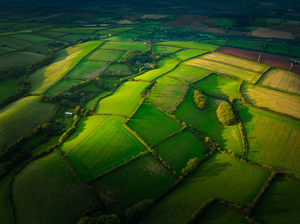
  • Low contrast: Using colors that are close to each other on the color wheel to create a more unified and soothing image. A landscape photo with various shades of green can feel peaceful and cohesive.

Techniques for balancing color contrast and harmony

Using the color wheel

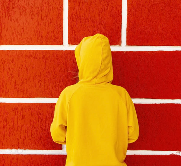
  • Complementary colors: Opposite on the wheel, these colors provide high contrast and make each other stand out. For instance, pairing blue with orange or red with green creates a vibrant contrast that draws attention.
  • Analogous colors: Next to each other on the wheel, they create harmony and a cohesive look. Using colors like blue, teal, and green together can create a serene and visually pleasing image.

Lighting and shadows

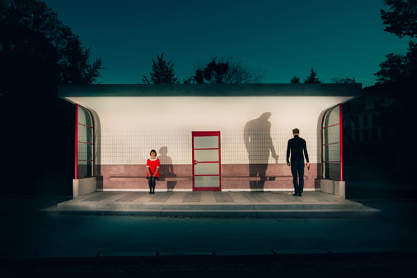
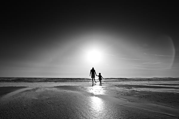
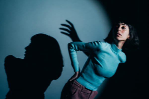
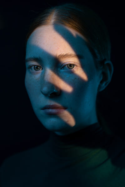
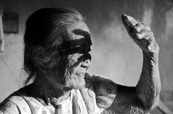
  • Highlighting contrast: Use lighting to enhance color contrast. For instance, a well-lit subject against a dark background. This technique can make the subject stand out more and add depth to the photo.
  • Balancing harmony: Soft, even lighting can help maintain color harmony by reducing harsh contrasts. This approach works well for portraits and nature photography where a calm and balanced look is desired.

Background and foreground

  • Contrasting elements: Use contrasting colors for the subject and background to make the subject pop. For example, a bright yellow flower against a purple background creates a striking contrast.
  • Harmonious elements: Ensure that the background and foreground have harmonious colors to create a unified look. This technique works well in landscape photography, where the sky, water, and land can all share similar hues for a cohesive composition.

Advanced techniques

Split-complementary scheme

  • Balanced contrast: This involves using a base color and two adjacent complementary colors. It offers vibrant contrast while maintaining harmony. For example, using blue with yellow-orange and red-orange in a sunset scene can create a balanced and visually appealing image.
  • Application: Use this in scenes where you want to highlight the subject without overwhelming the viewer.

Triadic color scheme

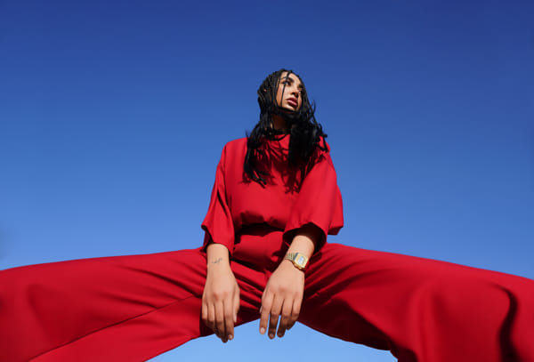
  • Dynamic balance: Uses three colors evenly spaced around the color wheel. This creates a balanced yet lively composition. An example would be using red, blue, and yellow in a single image, providing a vibrant and energetic look.
  • Implementation: Ideal for more complex scenes where multiple elements are controlled, such as fashion shoots or still life.

Editing for contrast and harmony

  • Post-processing: Enhance or reduce color contrast and harmony in editing software. Adjust saturation and vibrance to achieve the desired effect. Tools like the HSL panel in Lightroom can be used to fine-tune specific colors.
  • Selective color: Focus on specific colors in post-processing to either enhance contrast or bring harmony to the image. This technique can help in achieving the perfect color balance and making your subject stand out.

Practical tips to try

Using filters

  • Color filters: Enhance specific colors in your scene, helping to either create contrast or maintain harmony. For instance, a polarizing filter can enhance the blues in a sky while reducing glare.
  • Polarizing filters: Manage reflections and enhance contrast in outdoor photography. This filter is particularly useful for landscape photography.

Shooting in RAW

  • Adjustability: Shooting in RAW allows for greater flexibility in post-processing, helping you achieve the perfect balance of contrast and harmony.
  • Fine-tuning: Make precise adjustments to colors and tones during post-processing.

Field tips

  • Pre-visualization: Train your eye to see potential color contrasts and harmonies in your environment. Look for scenes where complementary or analogous colors naturally occur.
  • Practice regularly: Regular practice with color schemes will improve your ability to spot opportunities and refine your technique.

Balancing color contrast and harmony can transform your photos, making them more engaging and visually appealing. By understanding and applying these principles, you can create images that captivate your audience. Experiment with different techniques to find what works best for your style and subject matter

Not on 500px yet? Sign up here to explore more impactful photography.

The post Balancing color contrast and harmony in your photos appeared first on 500px.

[NDN/ccn/comedia Links]

Saturday, August 10, 2024

Creating Impact with Monochromatic Color Schemes

Monochromatic color schemes involve using different shades, tones, and tints of a single color to create cohesive and visually impactful images. This technique simplifies the color palette, allowing photographers to focus on composition, texture, and lighting. Here’s how to effectively use monochromatic color schemes to enhance your photography, with insights from professional photographers.

Understanding color contrast and harmony

Monochromatic color schemes use one base color and extend it using its shades (adding black), tints (adding white), and tones (adding gray). This approach creates a harmonious and unified look, making the subject stand out through subtle variations in the same hue.

Common applications

  • Black and white photography: This is the most well-known form of monochromatic photography, where all colors are converted to shades of gray.
  • Color monochrome: Using shades of a single color, such as blues or reds, to create a unified theme.

Techniques for balancing color contrast and harmony

Choosing the right color

  • Emotional impact: Different colors evoke different emotions. Blues can be calming, reds can be intense, and greens can be soothing. Choose a color that aligns with the mood you want to convey.
  • Subject suitability: Ensure the chosen color complements your subject. For example, greens work well with nature photography, while blues might suit urban scenes.

Lighting and shadows

  • Enhanced textures: Monochromatic schemes highlight textures and details that might be overlooked in color images. Use lighting to accentuate these elements.
  • Controlled lighting: Experiment with different lighting setups to see how shadows and highlights affect the various shades and tones of your chosen color.

Background and foreground

  • Consistent palette: Ensure the background and foreground elements are within the same color family to maintain cohesion. This can be achieved through careful selection of props and settings.
  • Texture contrast: Use textures to differentiate between elements in your composition. A smooth subject against a rough background can create visual interest within a single color scheme.

Advanced techniques

High-key and low-key monochrome

  • High-key: Focuses on lighter tones and minimal shadows, creating an airy and bright feel. Ideal for subjects that convey purity or simplicity.
  • Low-key: Emphasizes darker tones and deep shadows, adding drama and intensity. Perfect for creating a moody or mysterious atmosphere.

Selective monochrome

  • Accent color: Occasionally, introduce a single element in a different color to break the monotony and draw attention. This should be used sparingly to maintain the monochromatic integrity.
  • Post-processing: Convert your image to monochrome in post-processing, then selectively bring back color to specific areas for a striking effect.

Infrared monochrome

  • Infrared photography: Use infrared filters to capture unique monochromatic images. This technique reveals details and contrasts that are invisible to the naked eye, creating surreal and otherworldly photos.

Practical tips to try

Using filters

  • Color filters: Use color filters on your lens to enhance specific shades and tones of your chosen color. This is especially effective in black and white photography.
  • Polarizing filters: Helps manage reflections and enhance contrast within your monochromatic scheme.

Shooting in RAW

  • Adjustability: Shooting in RAW gives you greater flexibility to adjust shades, tones, and tints during post-processing without losing quality.
  • Fine-tuning: You can make precise adjustments to achieve the perfect balance of light and dark in your monochromatic image.

Field tips

  • Pre-visualization: Train your eye to see in shades and tones of a single color. This helps in composing your shots more effectively.
  • Practice regularly: Regular practice with monochromatic schemes will improve your ability to spot potential compositions and refine your technique.

Monochromatic color schemes can simplify your compositions while enhancing the visual impact. By focusing on shades, tones, and textures, you can create images that are both cohesive and striking. Experiment with different colors and techniques to find what works best for your style and subject matter.

Not on 500px yet? Sign up here to explore more impactful photography.

The post Creating Impact with Monochromatic Color Schemes appeared first on 500px.

[NDN/ccn/comedia Links]

Friday, August 9, 2024

Unlocking the potential of flash photography

Flash photography can dramatically enhance your images by adding light where it’s needed most. Whether you’re shooting portraits, still life, or even landscapes, mastering flash techniques can elevate your photography to new heights. Here’s a comprehensive guide to getting the most out of your flash.

Understanding flash photography

Flash photography involves using artificial light sources to illuminate your subject. This can be an on-camera flash, an external flash unit, or studio lighting. The key to successful flash photography is learning to control and modify the light to achieve the desired effect.

Essential techniques for creative flash photography

Bounce flash: Instead of pointing the flash directly at your subject, bounce it off a ceiling or wall to create a softer, more natural light. This technique reduces harsh shadows and spreads light evenly across your scene.

Diffused flash: Use a diffuser to soften the light from your flash. This can be achieved with commercial diffusers, homemade solutions like a tissue, or built-in diffusers on some flash units. Diffused light reduces the intensity of the flash, creating a more pleasing and less harsh illumination.

Off-camera flash: Moving your flash off-camera provides greater flexibility and creativity in your lighting setup. Use wireless triggers or sync cords to position the flash at different angles, creating dramatic and three-dimensional lighting effects.

Fill flash: Use your flash as a fill light to brighten shadows in outdoor shots, especially during harsh midday sunlight. This technique helps balance the exposure between your subject and the background, reducing contrast and improving overall image quality.

Advanced techniques

Rear curtain sync: Set your flash to rear curtain sync to fire at the end of the exposure rather than the beginning. This technique captures motion blur behind a sharply focused subject, adding a sense of movement and dynamism to your images.

High-speed sync: Use high-speed sync to shoot with flash at shutter speeds faster than your camera’s sync speed. This technique is ideal for freezing fast action or shooting wide open in bright conditions without overexposing your image.

Creative gels: Attach colored gels to your flash to add creative color effects to your images. Gels can be used to match ambient light, create interesting color contrasts, or simply add a splash of color for artistic effect.

Multiple flash setup: Use multiple flash units to create complex lighting setups. This technique allows you to control the light on different parts of your scene independently, adding depth and dimension to your images.

Practical tips for creative flash photography

Manual flash control: Learn to control your flash manually rather than relying on automatic settings. Adjust the flash power, zoom, and direction to get the desired lighting effect.

Light modifiers: Experiment with various light modifiers such as softboxes, umbrellas, and snoots. These tools help shape and control the light, allowing for greater creative expression.

Test shots: Take test shots to see how your flash setup affects the scene. Adjust your settings and setup as needed to achieve the best results.

Flash photography opens up a world of creative possibilities. By mastering these techniques and experimenting with different setups, you can add drama, depth, and impact to your images. Practice regularly, and don’t be afraid to push the boundaries of what you can achieve with your flash.

Not on 500px yet? Click here to learn about Licensing with 500px.

The post Unlocking the potential of flash photography appeared first on 500px.

[NDN/ccn/comedia Links]

Creating depth and drama with shadows

Shadows are a powerful, yet often underutilized element in photography. By mastering the use of shadows, you can add a sense of depth, dimension, and drama to your images, transforming ordinary scenes into extraordinary compositions. Here’s a guide to harnessing the creative potential of shadows in your photography.

Understanding shadows in photography

Shadows are created when an object blocks light, resulting in areas of darkness that contrast with the illuminated parts of your scene. Shadows can add texture, emphasize shapes, and create a sense of mystery or tension. The key is to learn how to control and manipulate shadows to enhance your images.

Techniques for creative shadow photography

Hard vs. soft shadows: Understand the difference between hard and soft shadows. Hard shadows have sharp, defined edges and are created by direct light sources like the sun or a spotlight. Soft shadows have blurred edges and are made with diffused light sources, such as an overcast sky or a softbox. Use hard shadows for dramatic, high-contrast images and soft shadows for a more gentle, nuanced effect.

Silhouettes: Create striking silhouettes by positioning your subject in front of a strong light source. Adjust your exposure for the background to render the subject in complete shadow, highlighting its shape and form. Silhouettes are most effective with recognizable shapes and convey a powerful, simplistic beauty.

Shadow patterns: Look for interesting patterns created by shadows. Objects with intricate details, such as lace curtains, tree branches, or architectural elements, can cast fascinating shadows that add complexity and interest to your images.

Directional light: Use directional light to control where shadows fall in your scene. Adjusting the angle and distance of your light source can create different shadow effects, from long, dramatic shadows to subtle, soft ones. Experiment with different lighting angles to find the most compelling compositions.

Advanced techniques

Double exposure with shadows: Combine two exposures in one image to create a surreal effect. Capture a shadow in one exposure and overlay it with another scene or subject in the second exposure. This technique can produce unique and imaginative images that challenge the viewer’s perception.

Shadow portraits: Use shadows creatively in portrait photography to add mood and character. Position your subject so that part of their face or body is cast in shadow, creating a mysterious and dramatic effect. Experiment with different lighting setups to find the most flattering and intriguing results.

Reflected shadows: Utilize reflective surfaces like water, glass, or polished floors to capture and manipulate shadows. Reflections can add depth and symmetry to your images, creating a dynamic interplay between light and shadow.

Shadow play in street photography: Incorporate shadows into your street photography to add an extra layer of narrative and context. Look for shadows cast by buildings, people, and street furniture to create compelling compositions that tell a story.

Practical tips for shadow photography

Shoot in black and white: Shadows often have a more pronounced impact in black and white photography. Removing color distractions allows you to focus on the interplay of light and shadow, emphasizing textures and contrasts.

Adjust your exposure: When photographing shadows, you may need to adjust your exposure to prevent losing detail in the highlights or shadows. Use exposure compensation or shoot in manual mode to find the perfect balance.

Use a tripod: A tripod can be essential for maintaining stability when experimenting with shadow photography, especially in low light conditions. It allows you to use slower shutter speeds without introducing camera shake.

Shadows are a versatile and powerful tool in photography. By experimenting with different techniques and approaches, you can harness the potential of shadows to create images with depth, drama, and a unique artistic touch. Embrace the creative possibilities that shadows offer and let them transform your photography.

Not on 500px yet? Sign up here to explore more impactful photography.

The post Creating depth and drama with shadows appeared first on 500px.

[NDN/ccn/comedia Links]