Thursday, May 29, 2025

Creating Harmony with Analogous Color Schemes

Analogous color schemes, composed of colors adjacent to each other on the color wheel, naturally produce harmonious and visually appealing images. These palettes offer photographers a gentle yet compelling approach to color, creating soothing, cohesive photographs that effortlessly draw viewers into a serene visual experience.

A bold architectural shot of a red door framed by an orange wall, showcasing harmonious analogous color schemes.

Understanding Analogous Colors

Analogous colors share common undertones and naturally complement each other, creating visual comfort and unity. Common examples include:

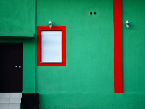
  • Warm Analogous Schemes: Red, orange, and yellow hues evoke warmth, energy, and positivity.
  • Cool Analogous Schemes: Green, blue, and violet hues convey calmness, tranquility, and introspection.

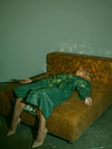
Emotional Impact of Analogous Colors

Each analogous color palette carries unique emotional associations. Selecting colors intentionally allows photographers to reinforce specific moods:

  • Warm palettes promote excitement, vitality, and optimism, ideal for lifestyle or dynamic portrait photography.
  • Cool palettes emphasize relaxation, peace, and contemplation, perfect for landscapes, seascapes, or reflective narratives.

Wind turbines set against a dramatic orange sky, capturing color harmony between natural elements and man-made structures.A minimalist abstract composition of pastel blue, turquoise, and yellow bands arranged in horizontal layers, illustrating adjacent colors.

Techniques for Successful Analogous Compositions

Creating powerful analogous compositions requires mindful planning and execution:

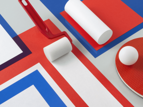
  • Dominant and Supporting Colors: Choose a primary color to dominate your composition, using adjacent hues to provide depth and visual interest.
  • Balancing Tonal Values: Incorporate a variety of tones within your analogous palette—from dark to light—to maintain visual balance and ensure clear differentiation between elements.

Lighting to Enhance Color Harmony

Lighting profoundly affects the appearance and interaction of colors within analogous schemes:

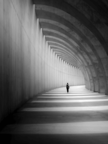
  • Natural Light: Soft, natural daylight enhances color cohesion, bringing out subtle tonal variations and supporting visual harmony.
  • Studio Lighting: Controlled lighting setups enable photographers to precisely manage color intensity, highlighting specific hues to strengthen composition and mood.

Composition Tips for Analogous Schemes

Intentional composition enhances the natural beauty and harmony of analogous color photography:

  • Simplify Your Scene: Removing unnecessary elements ensures the analogous palette remains clear, focused, and impactful.
  • Layering and Depth: Thoughtfully layering colors within your composition adds depth and encourages viewer engagement, inviting exploration of visual details.

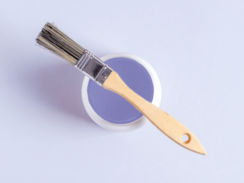
Refine Through Subtle Post-Processing

Analogous color photography often benefits from nuanced post-processing:

  • Adjust subtle differences in hue, saturation, and luminance to fine-tune harmony and enhance emotional resonance.
  • Consider gentle contrast adjustments to highlight variations without disrupting overall visual tranquility.

A warm-toned spiral staircase viewed from above, using emotional color to evoke a sense of depth and intrigue.

Analogous color schemes offer photographers a unique opportunity to create naturally harmonious and emotionally resonant images. By thoughtfully selecting your palette, carefully managing composition and lighting, and subtly refining in post-processing, you can produce photographs characterized by visual ease, depth, and emotional clarity.

Embrace the subtle power of analogous colors and elevate your photographic storytelling with visually cohesive, harmonious compositions.

Extended reading: Using Color to Strengthen Your Photographic Narratives

The post Creating Harmony with Analogous Color Schemes appeared first on 500px.

[NDN/ccn/comedia Links]

Thursday, May 22, 2025

Less is More: The Power of Minimalist Color Photography

Minimalist color photography thrives on simplicity, clarity, and restraint, using limited color palettes and streamlined compositions to create powerful visual impact. This style strips away distractions, emphasizing the essential elements of the scene and allowing photographers to convey strong emotions and clear narratives effectively.

A hand in a yellow sleeve reaches through a bright blue gate, highlighting minimalist color photography with bold, contrasting tones.

Embracing Simplicity

Minimalism isn’t about having fewer elements for the sake of simplicity alone; it’s about intentionality. Every aspect of your photograph—color, composition, and subject—should serve a clear purpose and contribute meaningfully to the image’s overall impact.

  • Limited Colors: Restricting your palette to a few colors or shades enhances visual clarity and emotional resonance.
  • Focused Subject: Clearly defined subjects with significant negative space help viewers immediately grasp the narrative or emotion you’re conveying.

Choosing Colors for Emotional Impact

In minimalist photography, your color choices are critical. Each hue carries emotional weight and meaning:

  • Monochromatic Schemes: Utilizing shades of a single color can create elegant, unified, and tranquil images.
  • Subtle Contrasts: Gentle contrasts in minimalist photos—such as muted pastels paired with soft neutrals—generate quiet, compelling visual interest.
  • Bold Accents: Introducing a single vibrant color against an otherwise neutral background can create dramatic visual tension, guiding the viewer’s eye directly to your subject.

A tall palm tree rises behind a pastel pink building under a clear sky, capturing minimalism through clean lines and soft colors.Two people relax in an infinity pool overlooking a calm sea and sky, reflecting simplified photography with serene composition and negative space.

Composition for Maximum Effect

Achieving successful minimalist photography relies heavily on thoughtful composition:

  • Negative Space: Extensive use of negative space emphasizes your subject, creating a serene yet compelling aesthetic.
  • Rule of Thirds and Symmetry: Utilize basic compositional techniques like the rule of thirds or symmetry to structure your image effectively, reinforcing clarity and visual harmony.
  • Minimal Details: Each detail included should significantly enhance your composition; extraneous elements dilute the minimalist impact.

The Role of Lighting in Minimalism

Lighting is essential to minimalist photography, significantly affecting mood and visual appeal:

  • Soft Lighting: Diffuse, gentle lighting helps maintain visual simplicity, reducing harsh contrasts and promoting a tranquil mood.
  • Directional Light: Controlled use of directional lighting can add subtle texture and depth, highlighting essential elements without introducing unnecessary complexity.

A cyclist rides through deep shadows cast by bold architectural lines, demonstrating visual clarity through sharp contrast and composition.

Refining Your Minimalist Vision

Minimalist photography challenges photographers to see beyond the surface, demanding careful planning and thoughtful execution. Cultivate the discipline to exclude unnecessary elements and focus solely on essential details. This approach allows the viewer to connect instantly with your message or emotion, leaving a lasting impression.

Minimalist color photography demonstrates the profound power of simplicity. By embracing restraint, carefully choosing your colors, mastering composition, and thoughtfully utilizing lighting, you can create visually impactful photographs that deeply resonate with your audience.

Explore minimalism in your photographic practice, and discover the strength and clarity of saying more with less.

Extended reading: Transforming ordinary scenes with vibrant colors

The post Less is More: The Power of Minimalist Color Photography appeared first on 500px.

[NDN/ccn/comedia Links]

Thursday, May 15, 2025

Harnessing Complementary Colors for Visual Drama

Complementary colors, positioned opposite each other on the color wheel, can produce some of the most vibrant and visually compelling images in photography. By understanding and strategically using them, photographers can create striking, balanced compositions that immediately captivate viewers. Here’s how to effectively harness this to infuse your photographs with drama and visual tension.

A green building facade with bold red accents and white window shutters, showcasing vibrant photography through strong complementary colors.

Understanding Complementary Colors

Complementary colors—like red and green, blue and orange, or yellow and purple—create powerful visual contrasts. When placed together, these colors enhance each other’s intensity, leading to dynamic and eye-catching images.

Understanding the emotional impact of complementary colors can significantly improve your photographic storytelling:

  • Red and Green: evoke passion and vitality
  • Blue and Orange: provide depth and warmth
  • Yellow and Purple: suggest creativity and vibrancy

A woman holding a glowing orange orb against a deep blue underwater backdrop, embodying vibrant photography through dramatic lighting and color contrast.

Creating Balance and Visual Tension with Complementary Colors

The key to successfully using complementary colors lies in achieving visual harmony. Allow one color to dominate the scene while using its complementary counterpart as a strategic accent. Thoughtful placement of these colors can effectively guide the viewer’s attention and create powerful visual interest without overwhelming the frame.

Utilizing Lighting to Enhance Color Contrasts

Lighting significantly influences how colors interact and appear in photographs:

  • Natural Lighting: During golden hour or blue hour, natural lighting emphasizes color contrasts, enhancing warmth or coolness.
  • Artificial Lighting: Controlled artificial lighting, such as colored gels or studio lights, can intensify color relationships and dramatize your compositions.

Aerial view of turquoise ocean waves crashing against golden sand, capturing the essence of vibrant photography through striking natural contrast.

Composition Techniques

Effective complementary color photography involves intentional composition:

  • Simplify your frame by removing unnecessary distractions to help colors stand out clearly.
  • Use neutral or uncluttered backgrounds to make colors truly pop.
  • Thoughtfully integrate complementary colors within your background to further enhance your subject.

Close-up of a glass marble resting on vivid orange and blue fabric, illustrating vibrant photography with rich textures and bold complementary colors.

Refining Your Image in Post-Processing

Post-processing plays an important role in finalizing the visual drama of your complementary color images:

  • Adjust contrast, saturation, and color balance to strengthen color relationships.
  • Enhance the overall aesthetic appeal and cohesiveness of your composition through careful editing.

Harnessing complementary colors effectively is a dynamic skill that enables photographers to convey vivid emotions, highlight intriguing narratives, and produce unforgettable imagery. By thoughtfully balancing composition, lighting, and post-processing, you can utilize colors contrast to create powerful and visually captivating photographs that resonate deeply with viewers.

Explore the potential of complementary colors and elevate your photographic vision with bold, impactful compositions.

Extended reading: Transforming ordinary scenes with vibrant colors

The post Harnessing Complementary Colors for Visual Drama appeared first on 500px.

[NDN/ccn/comedia Links]

Thursday, May 8, 2025

Mastering Monochrome: The Art of Single-Color Compositions

Monochrome photography isn’t just about black and white

It encompasses creating images using varying tones of a single hue. This powerful technique allows photographers to express emotion, simplify complex scenes, and direct viewer attention. Mastering monochrome photography can significantly enhance your visual storytelling, creating elegant, cohesive, and emotionally resonant images.

A minimal flat lay of a wooden paintbrush resting on a can of purple paint, illustrating monochrome photography with soft tonal consistency.

Understanding the Essence of Monochrome

Monochrome compositions are built around a single dominant color, employing different shades, tints, and tones within that hue. Whether classic black and white or contemporary color monochromes, these compositions rely on tonal variations rather than color diversity to convey depth and mood.

Choosing Your Monochromatic Palette

Selecting the right color for your monochromatic images is essential:

  • Classic Black and White: Timeless and dramatic, black-and-white photography highlights form, texture, and contrast, focusing on shapes and shadows rather than color.
  • Warm Tones: Colors like sepia, orange, or red can evoke warmth, nostalgia, and passion. These palettes excel at creating emotionally charged or historical narratives.
  • Cool Tones: Blue, green, and violet shades offer tranquility, melancholy, or introspection, ideal for serene landscapes, portraits, or reflective storytelling.

A person in a straw hat holds reflective discs over their eyes, captured in black-and-white with striking contrast and moody lighting.A lone figure walks through a shadow-filled architectural corridor, demonstrating single-color photography through light and form in grayscale.

Composing Strong Monochromatic Images

Effective monochrome compositions depend on thoughtful arrangement and clarity:

  • Emphasize Shapes and Patterns: Without multiple colors to differentiate elements, rely on shapes, lines, and textures to build interest and depth.
  • Balance Tonal Range: Use a full range of tones—from deep shadows to bright highlights—to create contrast and maintain viewer engagement.
  • Leverage Negative Space: Negative space helps to highlight your subject and gives a minimalist, powerful visual impact to your compositions.

Using Light and Shadow to Your Advantage

In monochrome photography, lighting plays a crucial role:

  • Directional Lighting: Side lighting or directional lighting accentuates textures and shapes, enhancing the three-dimensional feel of your composition.
  • Diffuse Lighting: Soft, even lighting reduces contrast, creating gentle, harmonious compositions suitable for emotional or subtle narratives.

Advanced Monochrome Techniques

Take your monochrome photography to the next level:

  • Selective Focus: Employ shallow depth of field to draw attention precisely where you want it, enhancing emotional connection through targeted clarity.
  • Intentional Motion Blur: Introducing subtle motion blur can add a sense of movement and energy to otherwise static monochrome images.
  • Creative Post-Processing: Experiment with contrast adjustments, tonal mapping, and dodging and burning to enhance the depth and drama of your monochrome compositions.

A glowing red hallway with repeating rectangular doorways and soft interior lighting, showcasing monochrome photography through bold architectural design.

Conveying Emotion through Simplicity

Monochrome photography is powerful precisely because of its simplicity. By removing the distraction of multiple colors, photographers can focus entirely on emotional storytelling and visual clarity. When executed thoughtfully, monochrome images communicate profound narratives that resonate deeply with viewers.

Embrace the art of monochrome photography to craft striking images that capture emotion, simplicity, and elegance. With deliberate composition, thoughtful color choices, and precise lighting, your monochromatic images will become powerful, timeless works of art.

Extended reading: Textures and patterns in monochrome photography

The post Mastering Monochrome: The Art of Single-Color Compositions appeared first on 500px.

[NDN/ccn/comedia Links]

Thursday, May 1, 2025

Making Bold Statements with Color Blocking in Photography

Color blocking is a powerful photographic technique that uses bold, solid colors placed strategically within an image to create visual interest, impact, and drama. By embracing simplicity and contrast, photographers can craft visually striking images that command viewer attention and evoke strong emotions. Here’s how to master color blocking and transform your photographic storytelling.

A flat lay of red, blue, and white geometric shapes, including a paint roller and ping pong paddle, showcasing color blocking in photography through minimal composition.

Understanding the Impact of Color Blocking

Color blocking involves composing photographs around large, defined areas of color, usually complementary or contrasting hues. This method draws the viewer’s eyes directly toward key elements in the image, creating a memorable and dynamic visual effect.

Choosing the Right Colors

Effective color blocking starts with careful color selection:

  • Complementary Colors: Colors directly opposite each other on the color wheel—such as blue and orange, or red and green—create visually arresting contrasts and emphasize each color vividly.
  • Analogous Colors: Colors adjacent to each other on the wheel, such as blues and greens or reds and oranges, produce a harmonious yet still impactful aesthetic.

Choose colors that reinforce your intended emotional tone—warm colors (reds, oranges) can evoke passion or excitement, while cool colors (blues, greens) can suggest tranquility or introspection.

A woman sits alone on a bus with striking blue lighting and orange seats, highlighting color blocking in photography through contrasting tones.A woman in a green dress reclines on a tan leather sofa under dappled light, demonstrating color blocking in photography with bold wardrobe and muted surroundings.

Creating Effective Compositions

Composition is key in color blocking. Consider these tips to enhance your images:

  • Simplicity is Strength: Focus on simplicity by eliminating clutter and distractions. Solid backgrounds and minimalist settings amplify the strength of your color choices.
  • Balance and Proportion: Arrange your colors and subjects thoughtfully to create visual balance. Strategic use of negative space can heighten the impact of bold colors.
  • Contrast for Clarity: High contrast between colors helps each element stand out clearly, ensuring your photograph’s composition remains compelling and visually accessible.

Utilizing Light to Enhance Color Blocking

Lighting dramatically influences how colors appear:

  • Natural Light: Natural daylight, especially during golden hour, enhances color saturation and brings warmth and vibrancy to your image.
  • Artificial Lighting: Creative use of studio lighting or off-camera flashes can emphasize or isolate color blocks, adding depth and dramatic flair to your photos.

Advanced Techniques for Exceptional Results

Take your color blocking to the next level with these advanced approaches:

  • Layering Colors: Layer foreground and background colors strategically to add depth and intrigue, inviting viewers to explore multiple layers within your composition.
  • Color Gradients: Introduce subtle gradients or transitions between color blocks to soften the effect slightly and add complexity to your visual storytelling.

A woman with red hair stands on a ladder against a large blue tiled wall, emphasizing color blocking in photography with vivid, complementary colors.

The Power of Intentionality

The essence of successful color blocking lies in intentionality. Every color and placement should contribute meaningfully to your composition, enhancing the story or emotion you’re conveying. Thoughtful planning and deliberate execution are essential to mastering this compelling technique.

By carefully selecting your palette, simplifying your compositions, and effectively leveraging lighting, color blocking can dramatically elevate your photographic narrative. Embrace boldness and let color guide your creative vision to produce unforgettable images.

Extended reading: Color clashes and bold choices in photography

The post Making Bold Statements with Color Blocking in Photography appeared first on 500px.

[NDN/ccn/comedia Links]