


 [NDN/ccn/comedia Links]
The photographer’s job resembles that of a magician. We tell our viewers: look right here, here is the hero of this story. A magician will use gestures and attractive assistants to guide their viewers’ attention. We have our own methods.
I like calling them the Four Horsemen of Viewer’s Attention.
The eye usually catches something big, sharp, bright, and warm. Let’s see how it works.
Scale is the relative (!) size of an object within a shot. Place a small object at the front, and it will make it more prominent. Put a bulky object in the back of a shot, and it will stop looking so bulky.
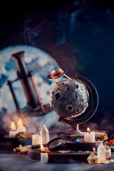
A large kaleidoscope is placed in the background. If you put it on the same plane as the asteroid and UFO, it would take up too much space and probably wouldn’t even fit within the frame. But in the background, it looks perfectly harmonious.
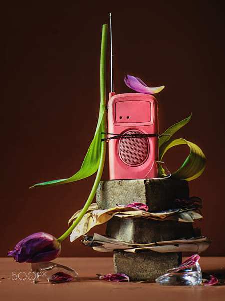
The scale is measured against other objects as much as against the frame of the shot itself. Here, the composition is framed too tightly, almost touching the edges. This leaves the shot feeling suffocated, as if you need to step back and take a breath.
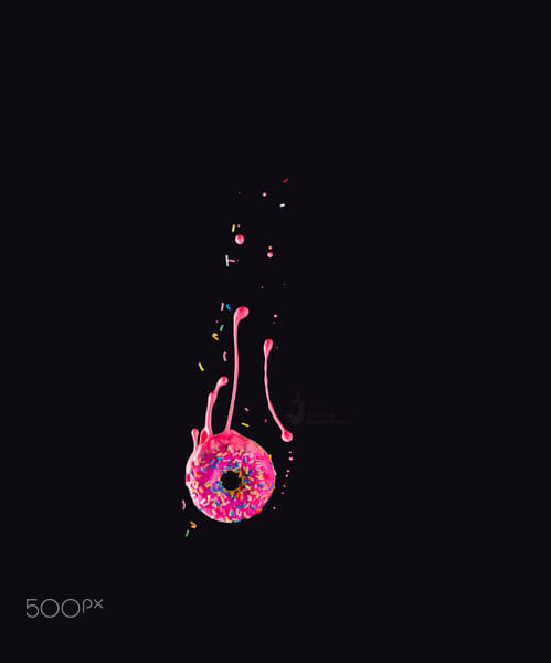
In contrast, this one could use a tighter crop. Otherwise, the donut seems to be floating in an infinite, cold, indifferent space.
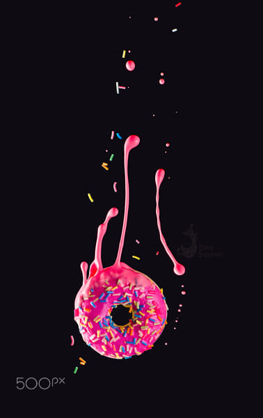
And here’s a better crop!
This should be really obvious. What should be in the focus? The main character, of course!
The real question here is the extent to which we can blur the background.
If you have an obvious hero that you want to separate from the background, you can work with maximum blur. However, if you have a hero working with an ensemble, it’s important to set sharpness in a way that doesn’t turn the support team into indistinguishable blots.
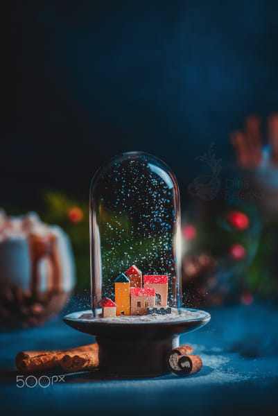
Here I don’t want the background to blur into bokeh, making all the objects in the back completely unrecognizable. I want the viewer to be able to make out the outline of the cup of hot chocolate and the pine branches. The fine details on these objects aren’t important to me, so I need a fairly strong blur, but not 100%.

There’s a kaleidoscope in the background. Its details are blurred, but the shape is still easily recognizable. Why do I need it in the frame? It adds dynamic upward movement and clarifies the identity of the colorful disk in the foreground.
When building a composition, we work with tangible objects that eventually become pixels on the screen. Even when blurred, we see these objects—like books or a kettle—because we know what they are. But the viewer, lacking this context, only sees a blurry blot, which can be distracting, causing the main subject to get lost in the scene.
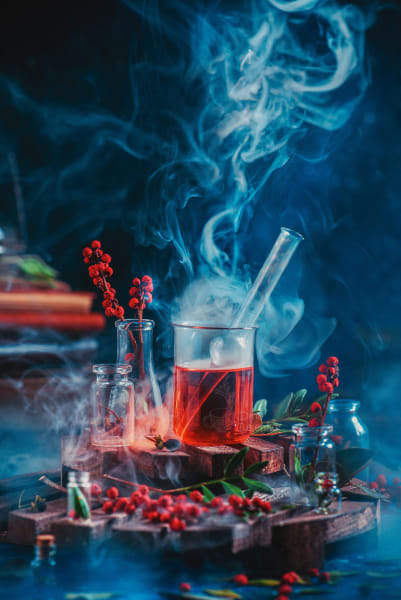
In this case, the stack of books on the left isn’t just bright on its own; it also creates a rhythmic structure of parallel lines that distracts the eye. It would be much better without it.
So, sometimes if the object gets turned into an unidentifiable blot, you may want to remove it from the shot entirely.
Obviously, the brighter the object, the easier it is to see. That doesn’t mean, though, that your main objects must shine. It simply means that if your main character gets lost in the shot, you can either aim some light towards it, or cut some lighting from the back, putting any distracting objects in shadow.
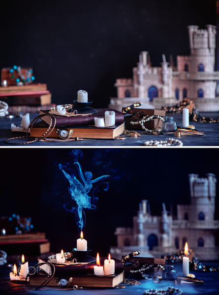
In this example, the lighting in the foreground stays the same, but it looks brighter thanks to a black flag that darkens the castle in the background. This makes the candle and the ballerina look brighter.
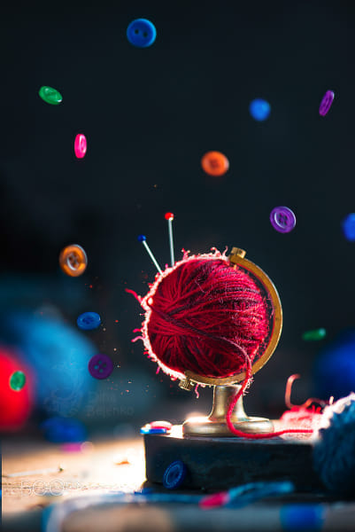
Here, the backlight doesn’t make the main object overall brighter, but accentuates the outline drawing our attention to it.
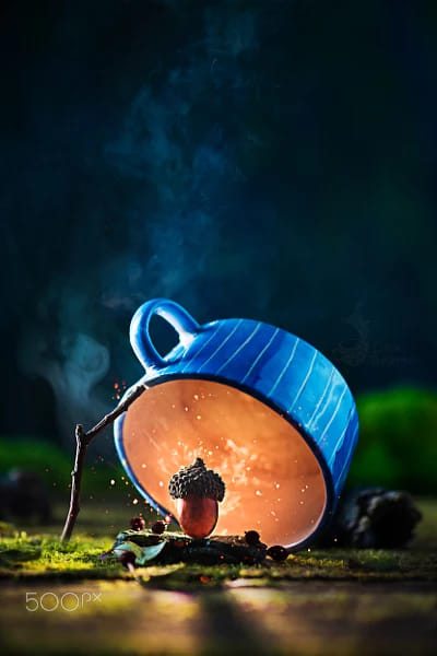
If you want to take this technique to the extreme, try creating a bright glowing spot with smoke or a sparkler.
The warmer the color is, the easier it is to notice. This effect can be further amplified by adding contrast with the background.
Compare these two donuts:
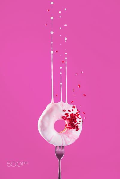
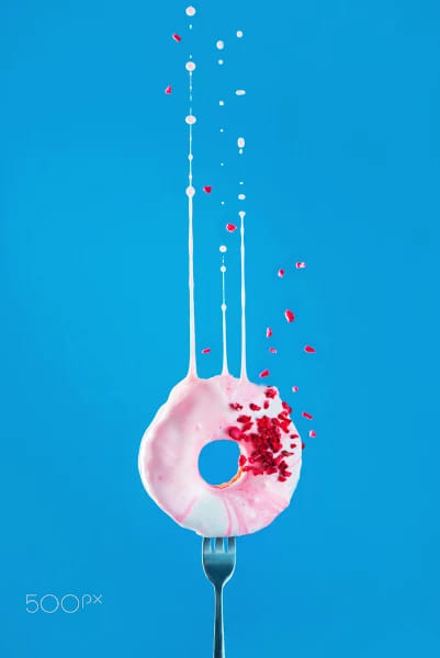
The donut looks more harmonious on a pink background, but more active and prominent on a blue one.
If you want a multi-object setup to look less chaotic, group your props based on color.
A photo palette is called that because it is, in fact, a palette, it does not feature all the colors of the spectrum, only the ones that you chose for your shot.

There are many small objects here: tomatoes, leaves, and scattered spices. But they easily group into two clusters: red and green. As a result, the image doesn’t feel overly busy or cluttered.

The entire photograph is done in two colors: gold on black. There’s no color contrast, but there is a contrast in brightness (light, shiny objects on a dark background).
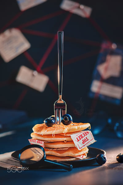
Here, colors are rhyming. The “Top Secret” label is red, so the threads of the mind map in the background are also red. The color of the paper is close to the color of pancakes. And the blueberries echo the blue shadows and highlights in the background.
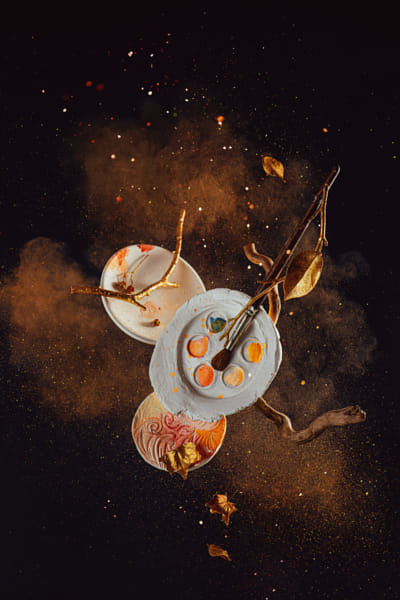
Here, the choice of color has a narrative significance. Gold, orange, and brown are the colors of autumn. Red is also an autumn color, but it seemed too bold for this shot. The calm palette is balanced by the explosive (literally!) movement.
It’s like coordinating an outfit. Wearing all your best pieces at the same time might not be a good idea. As in any outfit, colors need to go well together. In photos they can either rhyme or be in contrast with each other.
There’s a lot to be said about the Four Horsemen of Viewer’s Attention, but this is a quick outline to get you started. Hope it is helpful and motivational—stay inspired, and good luck!
Not on 500px yet? Click here to learn about Licensing with 500px.
The post Four horsemen of viewer’s attention: How to make people look appeared first on 500px.
[NDN/ccn/comedia Links]We know how much you love participating in Quests, pushing your creative limits, and sharing your incredible work. That’s why we’ve taken things up a notch and built PULSEpx—an entirely new app designed to take your Quest experience to the next level.

PULSEpx isn’t just another platform—it’s a space dedicated to Quests, where you can compete day in and day out, with contests tailored to your skill level. Whether you’re just starting out or are a seasoned pro, you’ll find Quests that match your expertise, making every competition fair and motivating. As you progress, you can move up in the ranks, challenging yourself to reach new heights while also competing for amazing prizes.
PULSEpx uses a skill-ranked system that matches you with photographers at your level. This isn’t about competing with everyone—it’s about competing with peers who are at a similar stage in their photography journey. This means every Quest is designed to challenge you just enough to help you grow and push your limits, while keeping things fair.
We know how important it is for your photos to be judged fairly. That’s why PULSEpx’s voting system is designed to ensure that every photo is evaluated based on its quality, not the photographer’s follower count or popularity. This way, your work gets the recognition it deserves, and the best shots always rise to the top.
With new Quests launching regularly, you’ll always have fresh opportunities to test your skills and showcase your creativity. Plus, with more rewards distributed across each contest, you have a higher chance of earning prizes, gaining recognition, and moving up the ranks. It’s not just about winning one big prize—it’s about continuous growth and rewarding your dedication.
If you’re a Pro or Awesome member on 500px, you’ll receive monthly rewards on PULSEpx, giving you access to even more contests and opportunities to win. It’s our way of saying thank you for being a part of our community and giving you the tools to take your photography even further.
PULSEpx is your new home for photography Quests—a place where you can compete, grow, and connect with photographers around the world. We’re excited to see how you’ll use PULSEpx to elevate your photography and reach new levels of creativity.
Ready to jump in?Download PULSEpx on the App Store or Google Play, and start exploring a whole new world of Quests.
The post PULSEpx: Elevate Your Photography Quests with Fair Competition and Skill-Based Challenges appeared first on 500px.
[NDN/ccn/comedia Links]Color contrast and harmony are essential elements in creating visually engaging photos. Properly balancing these elements can make your images more dynamic and pleasing to the eye. Here’s how to achieve the perfect balance.
Color contrast: The difference in luminance or color that makes objects distinguishable. High contrast can make images pop, while low contrast can create a subtle, soft look. High color contrast can make the main subject stand out more vividly. For example, placing a bright red subject against a green background will make the red pop due to the stark difference between the two colors. Conversely, using low contrast can create a more serene and cohesive image, such as using varying shades of blue in a seascape.
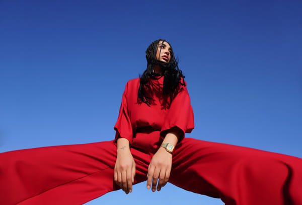
Color harmony: This is the pleasing arrangement of colors. Harmonious colors create a sense of order and balance in an image. Achieving color harmony involves using colors that naturally look good together, like analogous colors (colors next to each other on the color wheel) or a monochromatic palette. For instance, a photo with different shades of green can evoke a sense of tranquility and unity.

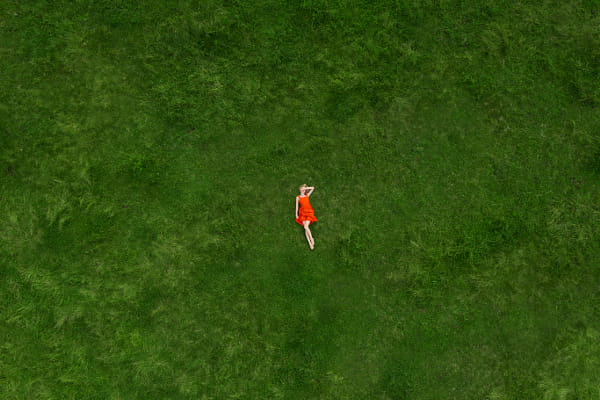
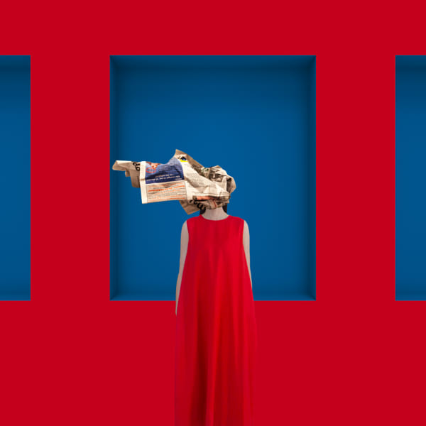
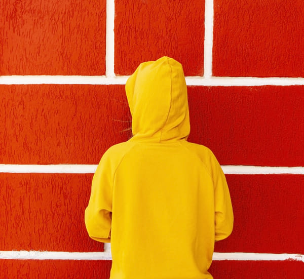
Balancing color contrast and harmony can transform your photos, making them more engaging and visually appealing. By understanding and applying these principles, you can create images that captivate your audience. Experiment with different techniques to find what works best for your style and subject matter
Not on 500px yet? Sign up here to explore more impactful photography.
The post Balancing color contrast and harmony in your photos appeared first on 500px.
[NDN/ccn/comedia Links]Monochromatic color schemes involve using different shades, tones, and tints of a single color to create cohesive and visually impactful images. This technique simplifies the color palette, allowing photographers to focus on composition, texture, and lighting. Here’s how to effectively use monochromatic color schemes to enhance your photography, with insights from professional photographers.
Monochromatic color schemes use one base color and extend it using its shades (adding black), tints (adding white), and tones (adding gray). This approach creates a harmonious and unified look, making the subject stand out through subtle variations in the same hue.
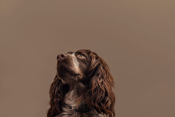
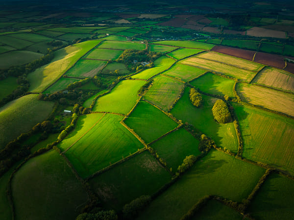
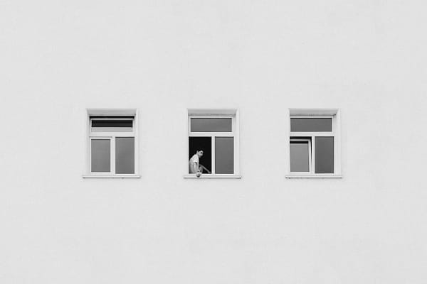
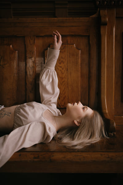

Monochromatic color schemes can simplify your compositions while enhancing the visual impact. By focusing on shades, tones, and textures, you can create images that are both cohesive and striking. Experiment with different colors and techniques to find what works best for your style and subject matter.
Not on 500px yet? Sign up here to explore more impactful photography.
The post Creating Impact with Monochromatic Color Schemes appeared first on 500px.
[NDN/ccn/comedia Links]Flash photography can dramatically enhance your images by adding light where it’s needed most. Whether you’re shooting portraits, still life, or even landscapes, mastering flash techniques can elevate your photography to new heights. Here’s a comprehensive guide to getting the most out of your flash.
Flash photography involves using artificial light sources to illuminate your subject. This can be an on-camera flash, an external flash unit, or studio lighting. The key to successful flash photography is learning to control and modify the light to achieve the desired effect.

Bounce flash: Instead of pointing the flash directly at your subject, bounce it off a ceiling or wall to create a softer, more natural light. This technique reduces harsh shadows and spreads light evenly across your scene.
Diffused flash: Use a diffuser to soften the light from your flash. This can be achieved with commercial diffusers, homemade solutions like a tissue, or built-in diffusers on some flash units. Diffused light reduces the intensity of the flash, creating a more pleasing and less harsh illumination.
Off-camera flash: Moving your flash off-camera provides greater flexibility and creativity in your lighting setup. Use wireless triggers or sync cords to position the flash at different angles, creating dramatic and three-dimensional lighting effects.
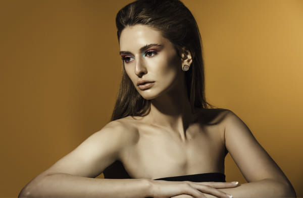
Fill flash: Use your flash as a fill light to brighten shadows in outdoor shots, especially during harsh midday sunlight. This technique helps balance the exposure between your subject and the background, reducing contrast and improving overall image quality.
Rear curtain sync: Set your flash to rear curtain sync to fire at the end of the exposure rather than the beginning. This technique captures motion blur behind a sharply focused subject, adding a sense of movement and dynamism to your images.
High-speed sync: Use high-speed sync to shoot with flash at shutter speeds faster than your camera’s sync speed. This technique is ideal for freezing fast action or shooting wide open in bright conditions without overexposing your image.

Creative gels: Attach colored gels to your flash to add creative color effects to your images. Gels can be used to match ambient light, create interesting color contrasts, or simply add a splash of color for artistic effect.
Multiple flash setup: Use multiple flash units to create complex lighting setups. This technique allows you to control the light on different parts of your scene independently, adding depth and dimension to your images.
Manual flash control: Learn to control your flash manually rather than relying on automatic settings. Adjust the flash power, zoom, and direction to get the desired lighting effect.
Light modifiers: Experiment with various light modifiers such as softboxes, umbrellas, and snoots. These tools help shape and control the light, allowing for greater creative expression.
Test shots: Take test shots to see how your flash setup affects the scene. Adjust your settings and setup as needed to achieve the best results.

Flash photography opens up a world of creative possibilities. By mastering these techniques and experimenting with different setups, you can add drama, depth, and impact to your images. Practice regularly, and don’t be afraid to push the boundaries of what you can achieve with your flash.
Not on 500px yet? Click here to learn about Licensing with 500px.
The post Unlocking the potential of flash photography appeared first on 500px.
[NDN/ccn/comedia Links]Shadows are a powerful, yet often underutilized element in photography. By mastering the use of shadows, you can add a sense of depth, dimension, and drama to your images, transforming ordinary scenes into extraordinary compositions. Here’s a guide to harnessing the creative potential of shadows in your photography.
Shadows are created when an object blocks light, resulting in areas of darkness that contrast with the illuminated parts of your scene. Shadows can add texture, emphasize shapes, and create a sense of mystery or tension. The key is to learn how to control and manipulate shadows to enhance your images.
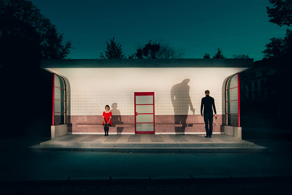
Hard vs. soft shadows: Understand the difference between hard and soft shadows. Hard shadows have sharp, defined edges and are created by direct light sources like the sun or a spotlight. Soft shadows have blurred edges and are made with diffused light sources, such as an overcast sky or a softbox. Use hard shadows for dramatic, high-contrast images and soft shadows for a more gentle, nuanced effect.
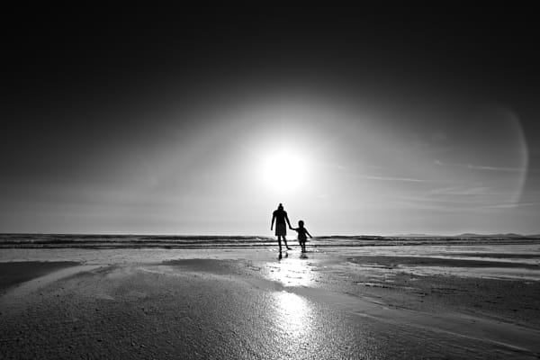
Silhouettes: Create striking silhouettes by positioning your subject in front of a strong light source. Adjust your exposure for the background to render the subject in complete shadow, highlighting its shape and form. Silhouettes are most effective with recognizable shapes and convey a powerful, simplistic beauty.
Shadow patterns: Look for interesting patterns created by shadows. Objects with intricate details, such as lace curtains, tree branches, or architectural elements, can cast fascinating shadows that add complexity and interest to your images.
Directional light: Use directional light to control where shadows fall in your scene. Adjusting the angle and distance of your light source can create different shadow effects, from long, dramatic shadows to subtle, soft ones. Experiment with different lighting angles to find the most compelling compositions.
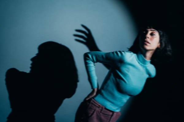
Double exposure with shadows: Combine two exposures in one image to create a surreal effect. Capture a shadow in one exposure and overlay it with another scene or subject in the second exposure. This technique can produce unique and imaginative images that challenge the viewer’s perception.
Shadow portraits: Use shadows creatively in portrait photography to add mood and character. Position your subject so that part of their face or body is cast in shadow, creating a mysterious and dramatic effect. Experiment with different lighting setups to find the most flattering and intriguing results.
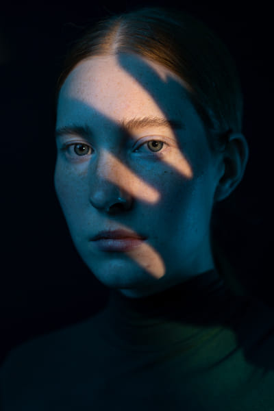
Reflected shadows: Utilize reflective surfaces like water, glass, or polished floors to capture and manipulate shadows. Reflections can add depth and symmetry to your images, creating a dynamic interplay between light and shadow.
Shadow play in street photography: Incorporate shadows into your street photography to add an extra layer of narrative and context. Look for shadows cast by buildings, people, and street furniture to create compelling compositions that tell a story.
Shoot in black and white: Shadows often have a more pronounced impact in black and white photography. Removing color distractions allows you to focus on the interplay of light and shadow, emphasizing textures and contrasts.
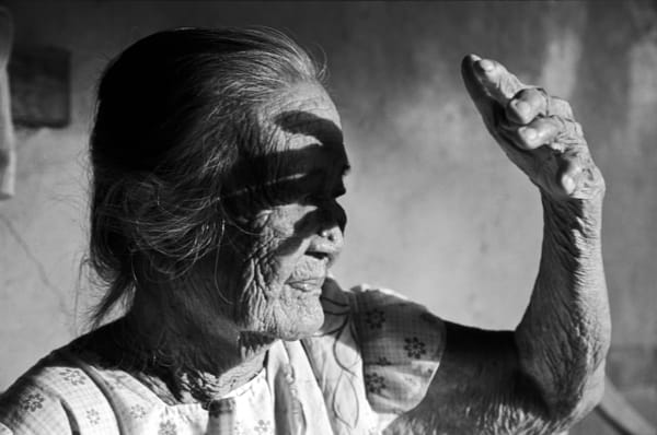
Adjust your exposure: When photographing shadows, you may need to adjust your exposure to prevent losing detail in the highlights or shadows. Use exposure compensation or shoot in manual mode to find the perfect balance.
Use a tripod: A tripod can be essential for maintaining stability when experimenting with shadow photography, especially in low light conditions. It allows you to use slower shutter speeds without introducing camera shake.
Shadows are a versatile and powerful tool in photography. By experimenting with different techniques and approaches, you can harness the potential of shadows to create images with depth, drama, and a unique artistic touch. Embrace the creative possibilities that shadows offer and let them transform your photography.
Not on 500px yet? Sign up here to explore more impactful photography.
The post Creating depth and drama with shadows appeared first on 500px.
[NDN/ccn/comedia Links]