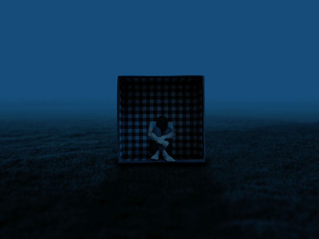
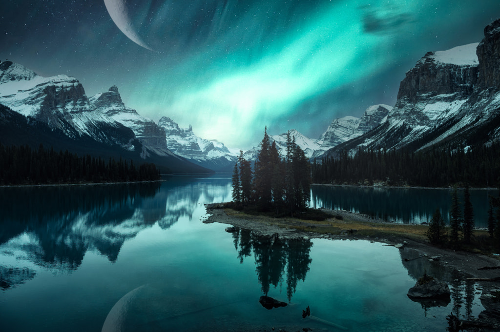
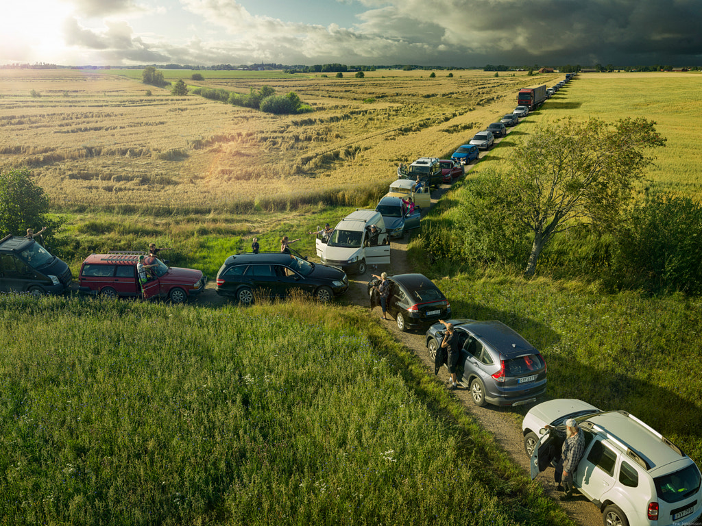
Since the invention of photography, artists have experimented with composite images, or single pictures made up of several different shots, figures, or scenes. The 19th-century photographer Henry Peach Robinson, for instance, was well-known for his method of combining multiple negatives to create a single seamless, imaginary scene (one of his most ambitious handmade works featured five negatives).
You might also be surprised to learn that one of the most famous photographs we have of Abraham Lincoln today is actually a composite: the President’s head was placed on another person’s body. The result was so convincing that it went largely unnoticed for decades.
A composite image describes any picture that uses elements from several separate shots. You can choose a composite for technical reasons, like preserving details in the shadows and highlights, or you can do it for creative purposes, such as building surreal or fantastical images that would be impossible in real life. For an in-depth look at the history of photo manipulation, including compositing, be sure to check out this article by the landscape photographer Ignacio Palacios.
Composites have been around for generations, but they’ve changed dramatically since Photoshop was created in the late 1980s. While early composites were made with painstaking manual precision, today’s photographers have an array of post-processing tools at their disposal for creating magical yet realistic composites. In the last year, with the rise of NFTs, we’ve seen the boundary between digital art and creative photography blur, opening up new artistic possibilities and inspiring many to experiment with new techniques.
Tip #1: Practice
The idea that you can create a masterful composite with “just a few clicks” on the computer is, unfortunately, a myth. One of the most straightforward ways to create a composite in Photoshop is by using the Magic Wand or Pen tools, Smart Objects, Blending Modes, and Layer Masks and then fine-tuning, but even then, these images will take time to perfect.
If you’re just getting started, the best thing you can do is play around in Photoshop with different tools and see what works. Begin with something very simple; many online tutorials will include downloadable photographs that you can use as you follow along with a basic composite. These tutorials will take you through the process step-by-step until you’re ready to apply what you’ve learned to your own photos.
Quick tip: If you’re using more than just a few layers, remember to name them and save as you go so your workflow stays organized and streamlined.
Tip #2: Use a sketch
Sketching is an essential step in building composite photos, and it can start during the process of conceptualizing your image. Some ideas for surreal photo collages might include giant objects, levitating models, or impossible juxtapositions. Perhaps you can even use a dream journal and create images based on your dreams.
When brainstorming, you can use a pencil and paper or sketch your idea out on a tablet. Relying on sketches will ensure that you get the shots you need to realize your composition, while also helping you to stay on track. The sketch does not have to be ready to hang in a museum, but it should be clear and easy to follow.
Quick tip: If you’re photographing the same scene multiple times for your composite, remember to bring a tripod to keep your positioning consistent.
Tip #3: Keep it consistent
Here’s another area where planning pays off: throughout all the elements you plan to composite, the lighting should remain consistent. If you’re in a studio setting, that’s easier to control; make sure the light in all your shots comes from the same direction and is similar in quality (hardness, temperature/ white balance, and so on).
If you’re shooting outdoors, it’s a good idea to plan for when the sun will be in the right place in the sky so that everything in your final photo appears to be illuminated by the same source. Like lighting, perspective and height are additional details you’ll want to remain consistent throughout your shots. Inconsistencies with the horizon line or vanishing point can ruin an otherwise great composite.
You can always tweak your brightness and color in post-production, but try to get it as close as possible before you sit down to edit. When you are editing those values on the computer, it helps to convert your photo to black and white so you can match the brightness levels across your subject, background, and foreground.
Tip #4: Take your time
Even simple composites take time to perfect, so set aside a good chunk of the day (or a few days) to assemble your images. The selection process, in particular, is easy to rush, but when cutting elements out, it’s important to be precise. Also, when you think you’re done with an image, step away for a bit and then return to it with fresh eyes. When it comes to consistency, it often helps to do some color grading as a final step, just to bring everything together. You can even add some grain or texture to help create a cohesive scene.
Tip #5: Study artworks that inspire you
The only way to train yourself to spot when something looks “off” or artificial in a composite is to consume as many images as you can. One place to start is with art history; Dutch Golden age paintings will teach you about how natural light falls throughout a scene. From there, look at photographs you love, both single frames and composites. What makes the image appealing, and what is it about the light, color, and texture that feels realistic?
Technical mastery will come with time, but immersing yourself in the arts and collecting inspirational images will help you brainstorm ideas to implement in the future. Many composite artists find inspiration in the surrealist movement, for instance, citing photographs by Man Ray or paintings by Salvador Dalí. Erik Johansson, a master of modern surreal photography, cites René Magritte among his inspirations. Consider keeping a diary, folder, or mood board where you can keep your reference photos and sketches as you tackle more and more ambitious composites.
Not on 500px yet? Click here to sign up.
The post Five tips for out-of-this-world composite images appeared first on 500px.
[NDN/ccn/comedia Links]


No comments:
Post a Comment