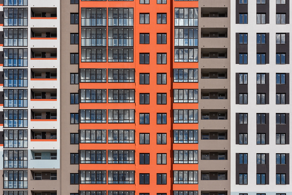
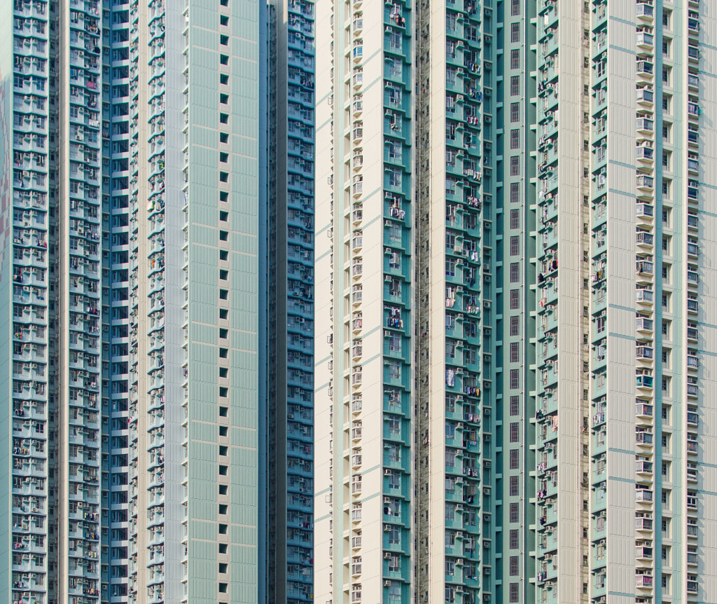
From Andy Yeung’s gravity-defying pictures of urban density in Hong Kong to Dany Eid’s atmospheric nighttime shots of Dubai, we’re living in a golden age for architecture photography. From Germany to Spain and beyond, the architecture student Julia Isaak captures minimalist shots, transforming building façades into eye candy, while Eric Dufour plays with colors and shapes in France and Denmark.
With the rise in green living spaces and the emergence of “15-minute” walkable cities topping trend reports, we predict that in 2022, architectural photography will continue to evolve with our changing ways of life. For photographers, cities are perpetual playgrounds, always shifting and expanding in real-time. In this quick guide, we’ll take a closer look at how using patterns in photography can enhance and elevate your architecture shots.
For the love of patterns
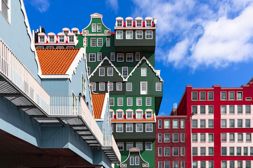
A pattern is a design formed from repeating elements, such as lines and shapes. These patterns can be regular, where the repetition of elements is predictable, or irregular, where these elements are unpredictable. Whether in nature or in the built environment, patterns help guide our eyes and shape our perceptions, consciously and otherwise.
Fractals—patterns that repeat across increasingly fine magnifications—are found often in both art and nature, from the paintings of Jackson Pollack to a bolt of lightning. According to groundbreaking research done by a professor by the name of Richard Taylor, these natural patterns can help reduce stress.
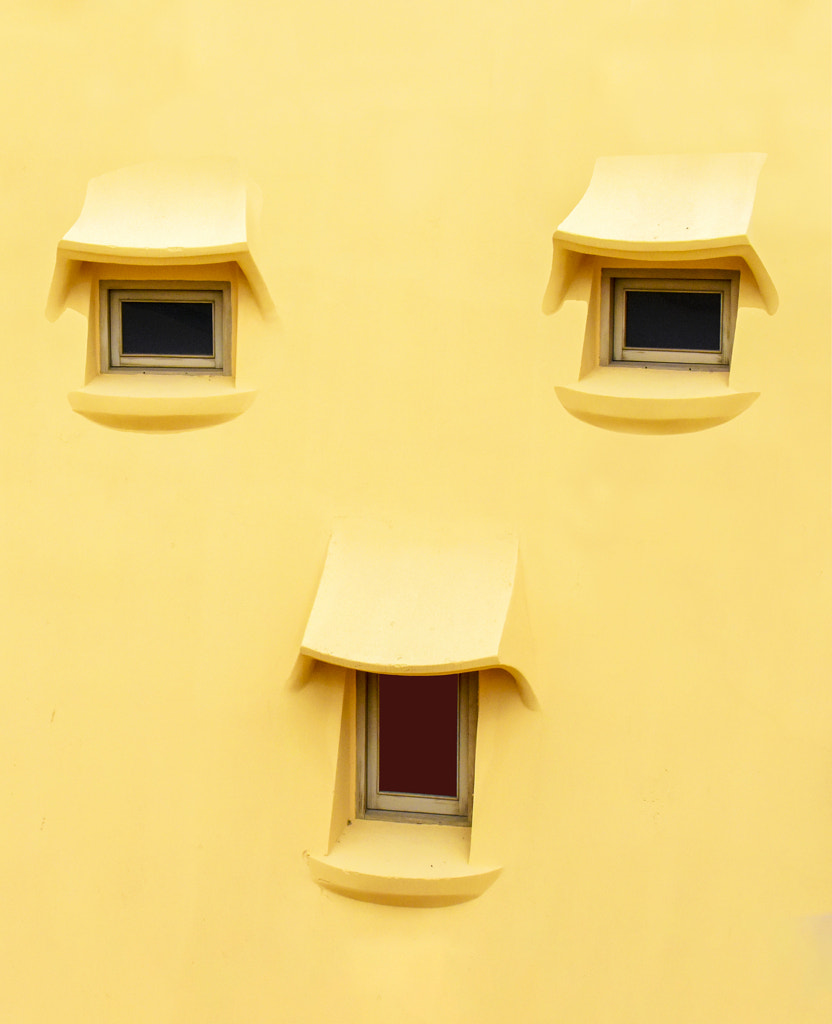
Research also indicates that we look for patterns even where they don’t exist. Our brains are so good at recognizing and responding to certain patterns, such as the features of a face, that we tend to see “faces” in inanimate objects, structures, and buildings. Further studies have even shown that infants tend to prefer patterns that look like faces over those that don’t.
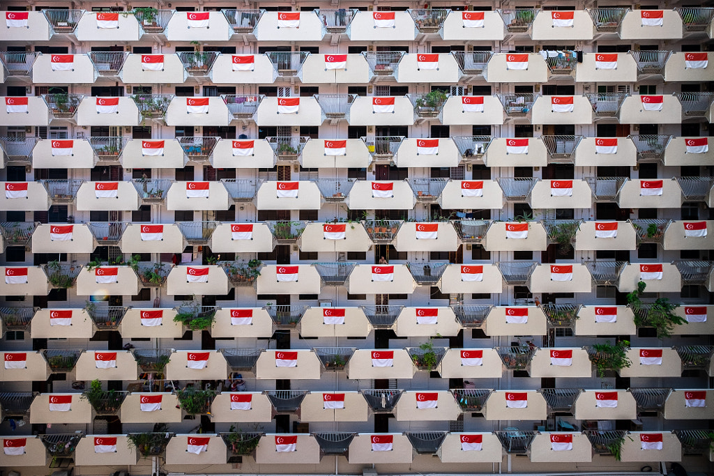
For architectural photographers, understanding—and harnessing—the power of patterns can instantly elevate a shot. BP Chua used the repeating motif of the Singapore flag, hanging from the corridors of a housing estate, to pull together the architectural shot above. Ash Camas even played on our affinity for recognizing faces when composing this minimalist view below of a sunny yellow building façade in Barcelona.
Read on for eight simple tips for effectively using repetition in photography.
Tip #1: Scout your spot
Researching your location is the single most important step to take before photographing a building or landmark. Whether you’re planning to shoot the terraced crown of the Chrysler Building in New York, the petals of the Lotus Temple in New Delhi, or the undulating curves of La Pedrera in Barcelona, understanding the history of the space will give you an idea of the most important details to include, as well as the original architect’s intent.
Tip #2: Fill the frame
There’s no rule that says you have to limit yourself to photographing the building in its entirety (though many clients will request plenty of these!). If you have time, remember to look for the finer details, and step closer to “fill the frame” with the colors, shapes, and lines of the building or its façade. If you want to keep everything in your frame in focus, consider closing down your aperture for a wider depth of field.
Tip #3: Keep it clean
Simple isn’t always better, but it often is, so keep an eye out for any details that might take away from your main subject, motif, or pattern, such as crowds of passersby, telephone wires, or signage. Exclude any extraneous elements for a more abstract view of the design and pattern of the space.
Tip #4: Look for moments of symmetry
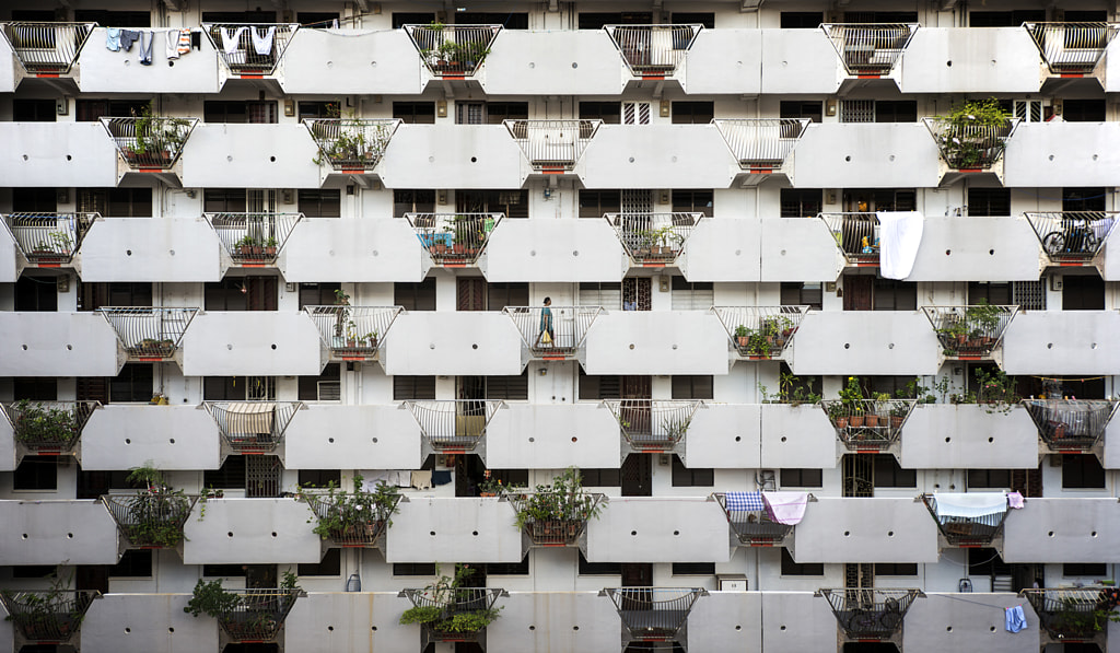
Symmetrical patterns are patterns where certain motifs appear identically on two sides. The most likely reason humans respond to symmetry is surprisingly simple: animals, whom our ancestors in the wild needed to recognize, tend to have symmetrical forms. When working with eye-catching lines or shapes in architecture, consider symmetry. You can even use a human figure to emphasize this sense of symmetry; in this picture from Singapore, for example, Philippe Put managed to catch a woman walking right through the middle of a block.
Tip #5: Straighten those lines
Clean, sharp lines are the defining features of many geometric patterns, whether it’s a line of repeating horizontal windows or vertical columns. For that reason, it’s important to use a tripod and hot shoe bubble level to maintain consistency throughout your shot. Bear in mind too that super wide-angle lenses, while popular in architectural photography, will also result in some distortions.
Tip #6: Follow the light
When shooting outdoors, lighting is everything, so plan accordingly. In addition to making sure the building is well-lit, you also want to check that any reflections and shadows fall in the right places, enhancing rather than detracting from the patterns at play in the space. Try waking up early or staying out late to make the most of your day.
It’s difficult, though not impossible, to shoot at midday, when the lighting is harsh and likely to blow out your highlights. At the golden hour, on the other hand, when the light is arguably its best, you’ll also get long shadows, which can open doors for further experimentation with lines and shapes.
Tip #7: Change your perspective
Most buildings are photographed from one “iconic” vantage point, but that doesn’t mean you’re limited to what you see in the brochures. In addition to photographing the structure head-on, try climbing to a nearby rooftop to capture what it looks like from above. Or lie down for a bug’s eye view, looking up onto the building as it rises. You can even layer buildings at different depths or use their patterns as a backdrop for another subject. By staying on your feet and changing your angles, you’ll be more likely to notice patterns others have overlooked.
Tip #8: Break it up
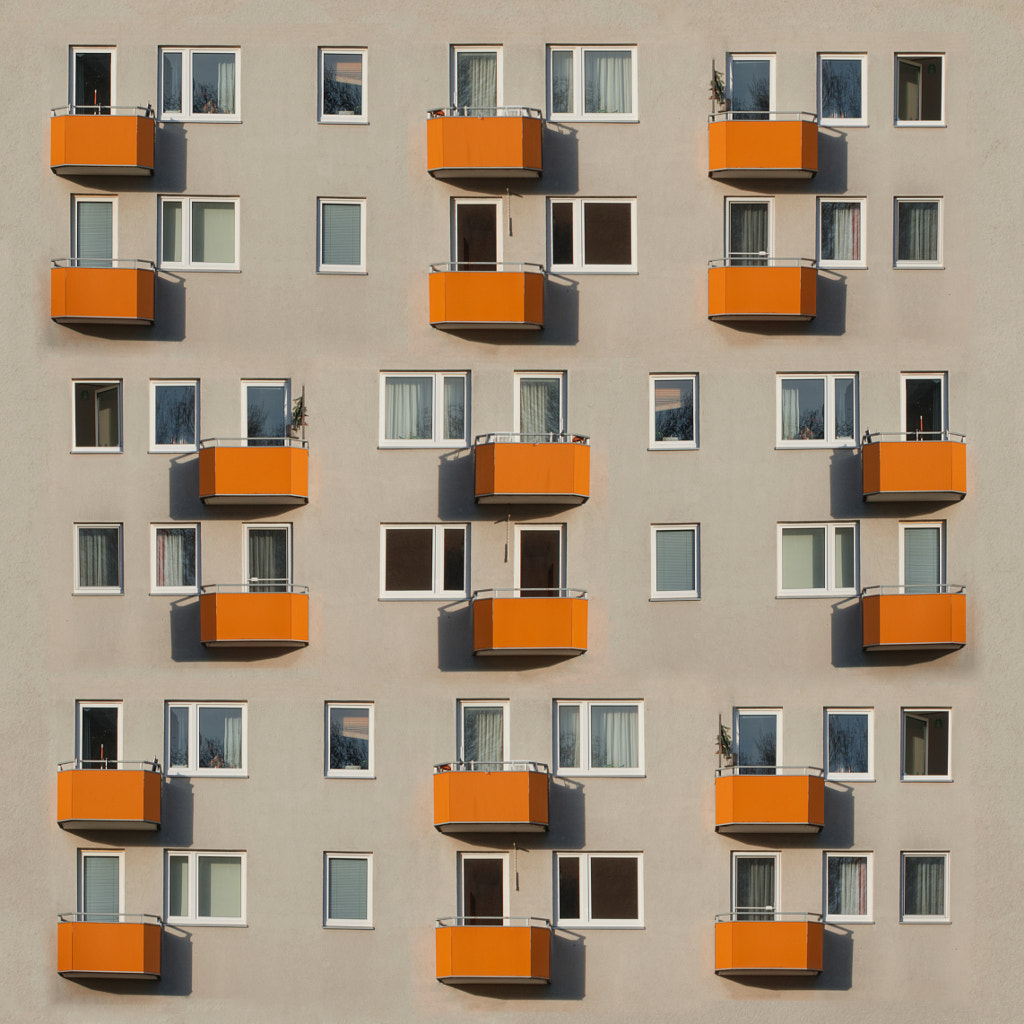
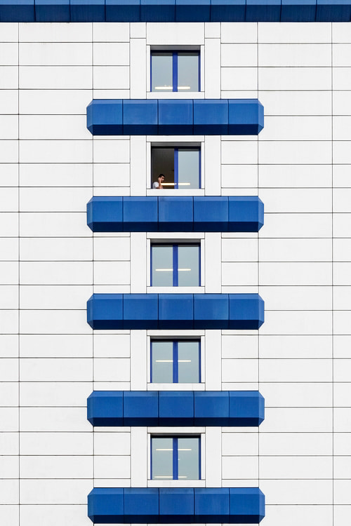
Finally, one of the most effective ways to use patterns is by establishing them—and then breaking them up. This is an underrated technique for drawing attention to the pattern while also capturing our attention and playing with expectations. In this photograph from Berlin, Eric Dufour breaks up the pattern established by the windows in the façade to reveal one open window, with a figure sitting inside.
Our last tip: gather a bunch of architecture inspo from 500px, social media, and classic photobooks before your next shoot. It could be Berenice Abbott’s photographs of New York or Julius Shulman’s pictures in Los Angeles that spark a new idea on capturing a structure or landmark in your hometown. Consider how other photographers use lines, color, perspective, and pattern to catch and hold the eye. “Humans look for order in things, and this inclination can be honed in on to create compelling and complex images,” the 500px team tells us.
Not on 500px yet? Sign up here to explore more impactful photography.
The post Why our eyes look for patterns in architecture appeared first on 500px.
[NDN/ccn/comedia Links]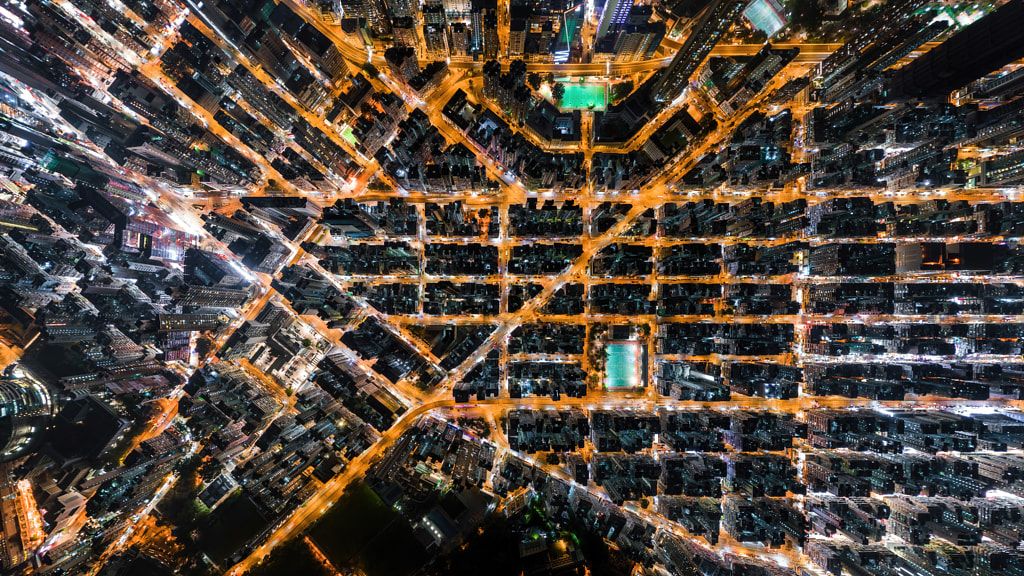

No comments:
Post a Comment