More than a decade ago, the camera brand Leica revealed an eye-catching print and outdoor ad campaign in Switzerland, featuring photographs of various textures found throughout everyday city life: wood, metal, bricks, and more. The ads were installed on real-life walls of the same texture, revealing the up-close details of each surface. The goal was simple: show off the sharp details the camera was capable of capturing.
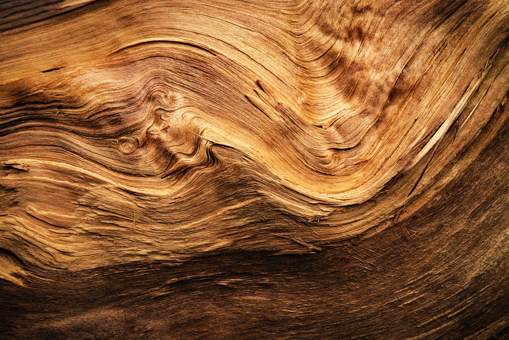
Even years later, the campaign underscores the power of texture in marketing; when done well, the most ordinary surfaces can stand out and draw our attention, even in bustling city streets. In the 500px Collection on Getty Images, some of the most popular visuals use texture as a key element: the rough feel of wood, the curvature of textured rock, the frosted surface of berries in wintertime, or the shininess of an apple.
In Part 1 of our article on texture for Licensing Contributors, we highlighted the power of touch in advertising—including the ways in which marketers have tapped into our senses through images of gooey chocolate, creamy frosting, or fizzy beverages. In Part 2, we’ll share some techniques for capturing and enhancing texture in your portfolio.
Light from the side
The direction, quality, and proximity of your light source will play a role in how you render texture throughout your photograph. While front lighting might “flatten” your subject, side lighting creates shadows and dimensionality and is therefore ideal for capturing texture. Whether you’re shooting with an off-camera flash or using natural window light, keeping that light to the side of your subject will bring out its textures. Similarly, hard light exaggerates textures, while soft light smooths them out.
Finesse your exposure settings
As we covered in our recent guide to sharper photos, your exposure settings will often determine how sharp your image will be—an essential consideration when capturing texture. Keep your ISO setting low to avoid noise and grain, and set your aperture somewhere within your lens’s sweet spot, or the setting at which it’s sharpest (usually, two to three stops from the max setting).
A wider aperture can be used to create a blurred or “creamy background,” while a narrow one will increase your depth of field, allowing you to maintain detail in the foreground and background. A faster shutter speed will freeze objects in motion, while a longer exposure will create blur. In some cases, such as photographing bodies of water or skies, that blur can actually create a texture in and of itself, rendering waves or clouds as “milky” and ethereal.
Experiment with lenses
Macro lenses are perfect for capturing those up-close details you just can’t see from a distance. If your subject is small, a macro approach isn’t just nice to have; it’s a must. With that being said, you can always use extension tubes to practice before switching to a dedicated macro lens. When shooting macro, rely on a sturdy tripod and remote shutter release, and use live view and manual focus for that perfect, sharp focus on those details.
“Macro photography is a great way to experiment and find texture,” the 500px team tells us. “Crop scenes to isolate texture and lines, and use depth to create interesting compositions.” These images can be representational or abstract; consider “filling the frame” for a more abstract, textural feel.
Use a light touch in post-production
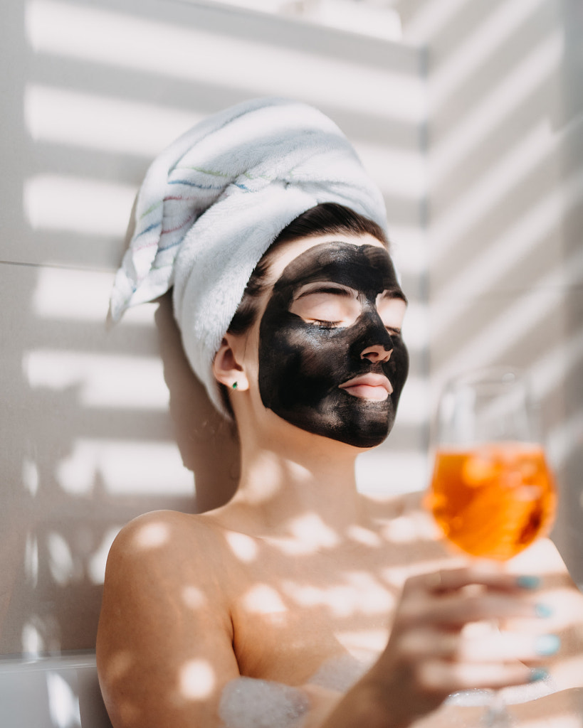
In the past, it was standard practice to smooth human skin textures in post-production, and in many ways, that’s still the norm. But as we mentioned in Part 1 of our exploration of texture, some brands are challenging this and embracing the details that make their models unique, from freckles and acne to wrinkles and stretch marks. Late last year, for example, the jewelry brand Bulgari grabbed headlines for celebrating Paris Jackson’s skin texture in an unretouched campaign.
Especially when working with photographs of people, a light touch in post-production goes a long way. Similarly, while textures can always be added in post-production through the use of filters and overlays, we recommend avoiding extreme effects in your Licensing submissions. Instead, keep your textures natural and true to life. Image buyers can always add textures if they wish, but in order to appeal to a wide range of clients, it’s best to start with a clean slate.
Of course, that doesn’t mean you shouldn’t edit your photographs. On the contrary, adjusting your contrast can affect the texture of your scene, and dodging and burning can give you full control over the darks and lights throughout the image. It’s all about striking that balance so that your textures look realistic while also “popping” off the screen.
Texture in commercial photography, from still life to lifestyle
In Part 1 of this guide, we touched on the many possible applications of texture across commercial photography, from portraits to interiors and beyond. Texture can enhance elements in nature, as in a macro photograph of leaves after the first snow. Or it can suggest the flavors of sugar beets, pulled straight from the earth. (Both of these pictures are among the most popular in the 500px Collection on Getty Images.)
Products, too, can be elevated through the use of texture. Hermès recently highlighted the tactile qualities of the H08 luxury watch, for instance, through a short film called The texture of time. Of course, we often see texture used in food advertising (consider the crunch of Cap’n Crunch or, more recently, the creaminess of Nitro Pepsi) as well. Food photographers regularly use natural side lighting to bring out those natural textures.
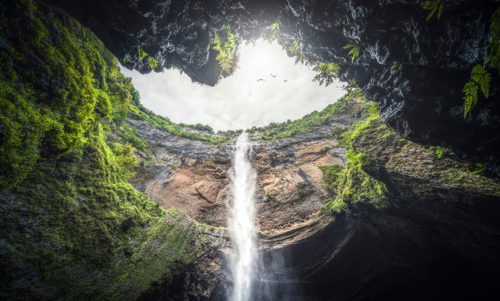
Similarly, in landscapes, texture can evoke feelings: the glassy tranquility of a lake before dawn, the slickness of an icy cave, or the roughness of a mountain face. But textures can also be used more subtly in lifestyle photography. In portraiture, we’re seeing more diversity in the textures of skin and hair, celebrating real people over airbrushed “perfection.”
If you’re shooting indoors, texture can play a key role in your styling choices, from wardrobe to decor. “Fuzzy pillows suggest warmth, while plants add a natural touch,” the team at 500px says. In the last year, textured walls have come into fashion, as have natural fabrics like linen and jute. These are all details you can incorporate for a more natural—and trendy—twist on timeless subjects.
Not on 500px yet? Click here to learn about Licensing with 500px.
The post How to effectively capture texture in your commercial content (Part 2) appeared first on 500px.
[NDN/ccn/comedia Links]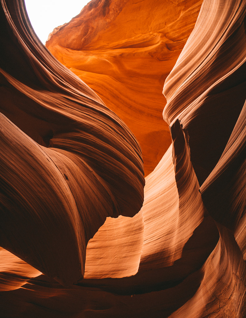




No comments:
Post a Comment